Install

- Download and install:
- R (https://www.r-project.org/)
- R studio (https://www.rstudio.com/) (Optional)
- In R or R studio:
install.packages("devtools")
devtools::install_github("JGCRI/rchart")
Additional steps for UBUNTU from a terminal
sudo add-apt-repository ppa:ubuntugis/ppa
sudo apt-get update
sudo apt-get install -y libcurl4-openssl-dev libssl-dev libxml2-dev libudunits2-dev libproj-dev libavfilter-dev  libmagick++-dev
Additional steps for MACOSX from a terminal
brew install pkg-config
brew install imagemagick@6
Input Formats
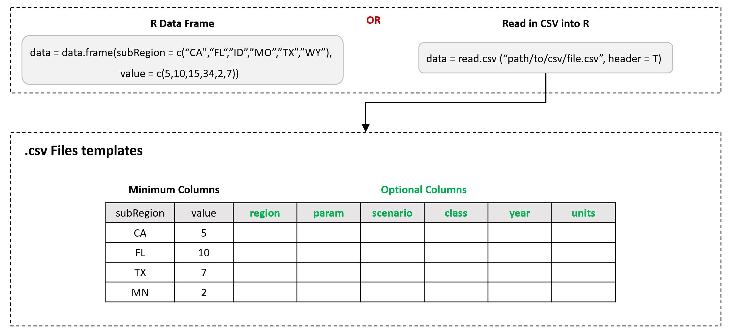
The main input is the data argument in the chart() function. This will be an R table which can be created within R or read in from a csv file as shown below.
Output Formats
The output of the chart() function is a named list with all charts and animations created in the function. The elements of the list can be called individually. Since the output charts are ggplot elements all the features of the chart can easily be modified using the traditional ggplot2 theme options. Examples are provided in the Themes section.
Save, file, folders
The following example show the key arguments available to save output charts
library(rchart);
data = data.frame(scenario = c("scen1","scen1","scen1",
                               "scen2","scen2","scen2",
                               "scen3","scen3","scen3"),
                  year = c("2010","2020","2030",
                           "2010","2020","2030",
                           "2010","2020","2030"),
                  param = c(rep("param_1",9)),
                  value = c(32, 38, 54,
                            37, 53, 23,
                            40, 44, 12))

my_chart <- rchart::chart(data,
                          append = "_appendName", # Will append names to each chart
                          folder = "myfolder", # Will create a new folder if needed
                          save = T, # This is True by default but can be turned off for rmarkdown docs
                          show = T # This is true by default but can be turned off to speed up processing and avoid charts displayed in console.
                          )

my_chart$chart_param # For just this chart rchart::chart(data, chart_type="param_absolute")
Chart Type
As demonstrated in the various examples below, rchart can produce various types (line,bar, absolute, diff) charts. For each param in a given datatable rchart produces line charts while for each class (sub-categories of param) rchart produces bar charts as well as line charts (for percentage differences). The user can set the chart_type argument in order to only produce the particular kind of chart they would like. A summary of chart_type options is provided below:
- “all” (Default)
- “param_absolute”
- "param_diff
- “class_absolute”,
- “param_diff_absolute”
- “class_diff_absolute”
- “param_diff_percent”
- “class_diff_percent”
- “region_absolute”
Users can also choose a combination of one or more of these arguments such as in: class_type = c("param_diff","class_diff_percent")
Plot Param Absolute
Chart with params in each facet and multiple lines for each scenario. If class column provided this will be aggregated to the param depending on if the aggregate column is sum or mean (Default sum is used).
Single Param
library(rchart);
data = data.frame(scenario = c("scen1","scen1","scen1",
                               "scen2","scen2","scen2",
                               "scen3","scen3","scen3"),
                  year = rep(c(2010, 2020, 2030), times = 3),
                  param = c(rep("param_1",9)),
                  value = c(32, 38, 54,
                            37, 53, 23,
                            40, 44, 12))

my_chart <- rchart::chart(data, save = F)
my_chart$chart_param # For just this chart rchart::chart(data, chart_type="param_absolute")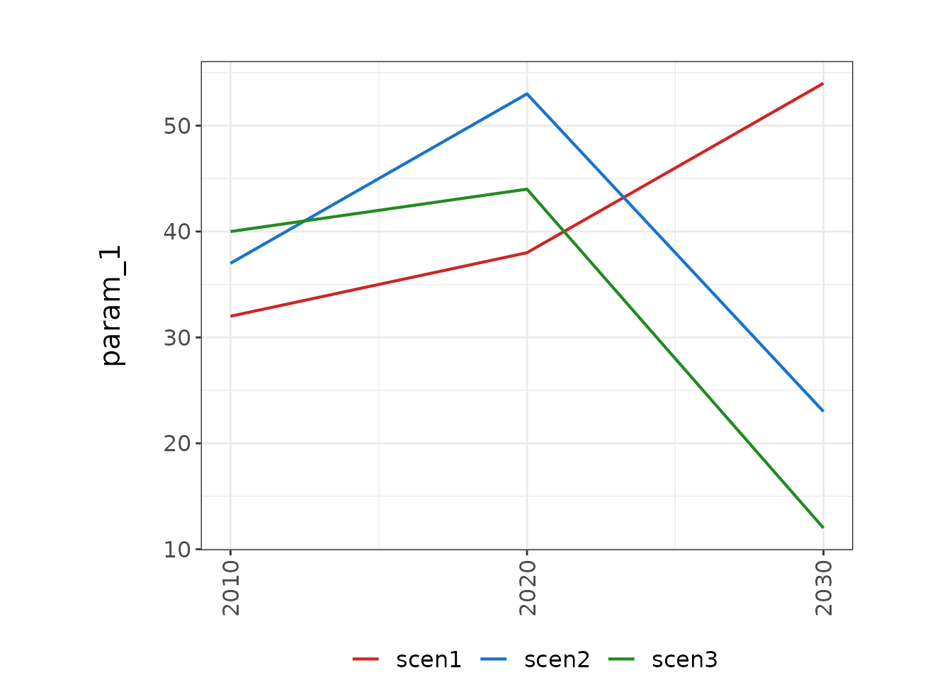
Multiple Params
library(rchart);
data = data.frame(scenario = rep(c("scen1","scen1","scen1",
                               "scen2","scen2","scen2",
                               "scen3","scen3","scen3"),3),
                  year = rep(rep(c(2010, 2020, 2030),3),3),
                  param = c(rep("param_1",9),
                            rep("param_2",9),
                            rep("param_3",9)),
                  value = c(c(32, 38, 54,
                              37, 53, 23,
                              40, 44, 12),
                            c(10, 21, 24,
                              67, 83, 93,
                              10, 34, 02),
                            c(50, 121, 124,
                              367, 483, 593,
                              100, 304, 102)))

my_chart <- rchart::chart(data, save = F)
my_chart$chart_param # For just this chart rchart::chart(data, chart_type="param_absolute")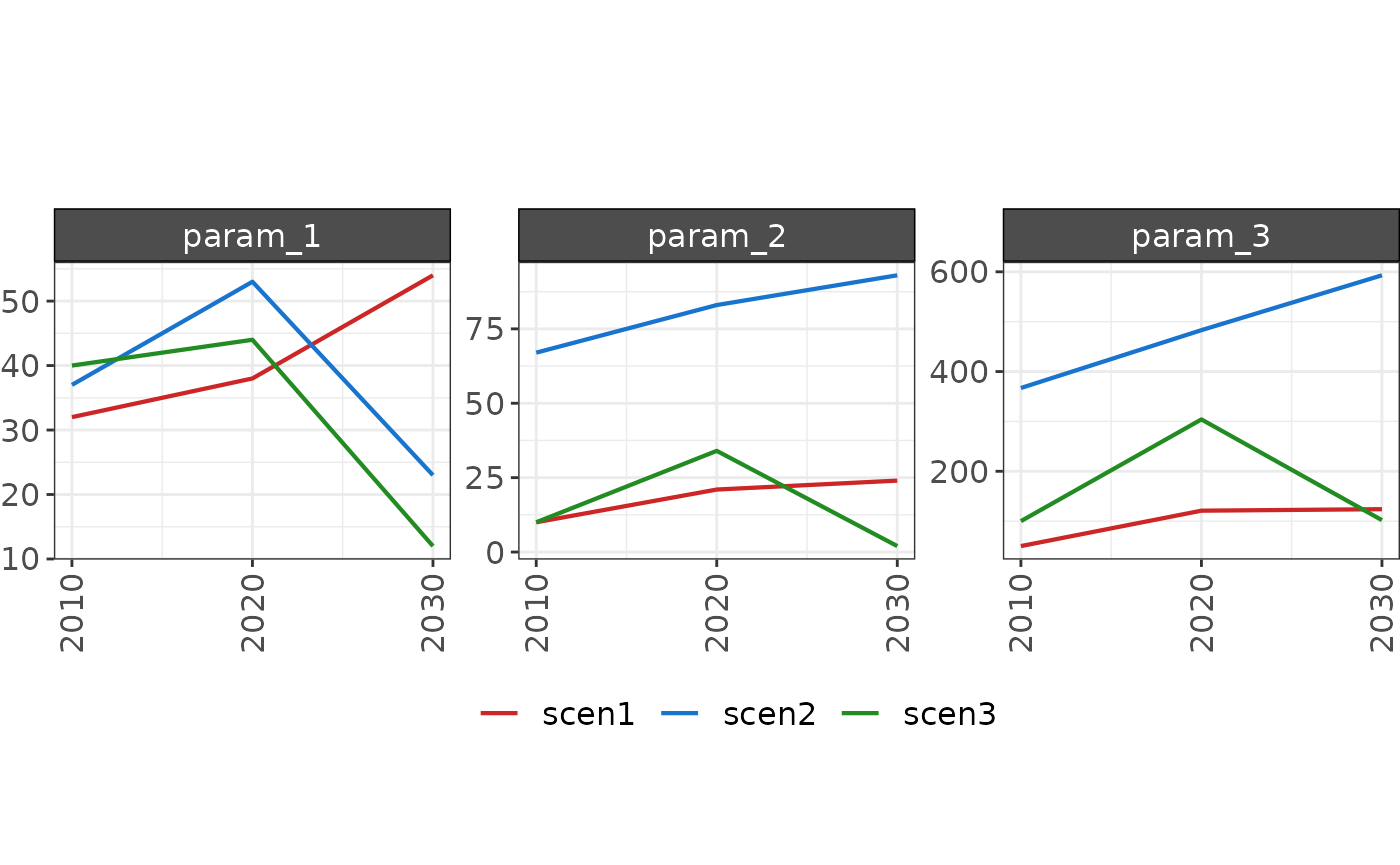
Multiple Params & Regions
library(rchart);
data = data.frame(region = rep(c("Spain", "India","Spain", "India","Spain", "India",
                                "Spain", "India","Spain", "India","Spain", "India",
                                "Spain", "India","Spain", "India","Spain", "India"),3),
                  scenario = rep(c("scen1","scen1","scen1","scen1","scen1","scen1",
                               "scen2","scen2","scen2","scen2","scen2","scen2",
                               "scen3","scen3","scen3","scen3","scen3","scen3"),3),
                  year = rep(c("2010","2010","2020","2020","2030","2030",
                           "2010","2010","2020","2020","2030","2030",
                           "2010","2010","2020","2020","2030","2030"),3),
                  param = c(rep("param_1",18),
                            rep("param_2",18),
                            rep("param_3",18)),
                  value = c(c(32, 38, 54, 63, 24, 23,
                              37, 53, 23, 12, 45, 47,
                              40, 44, 12, 30, 99, 103),
                            c(10, 21, 24, 13, 14, 13,
                              67, 83, 93, 92, 95, 107,
                              10, 34, 02, 10, 39, 33),
                            c(50, 121, 124, 113, 214, 313,
                              367, 483, 593, 692, 795, 907,
                              100, 304, 102, 107, 339, 233)))

my_chart <- rchart::chart(data, save = F) # For just this chart rchart::chart(data, chart_type="param_absolute")
my_chart$chart_param_Spain 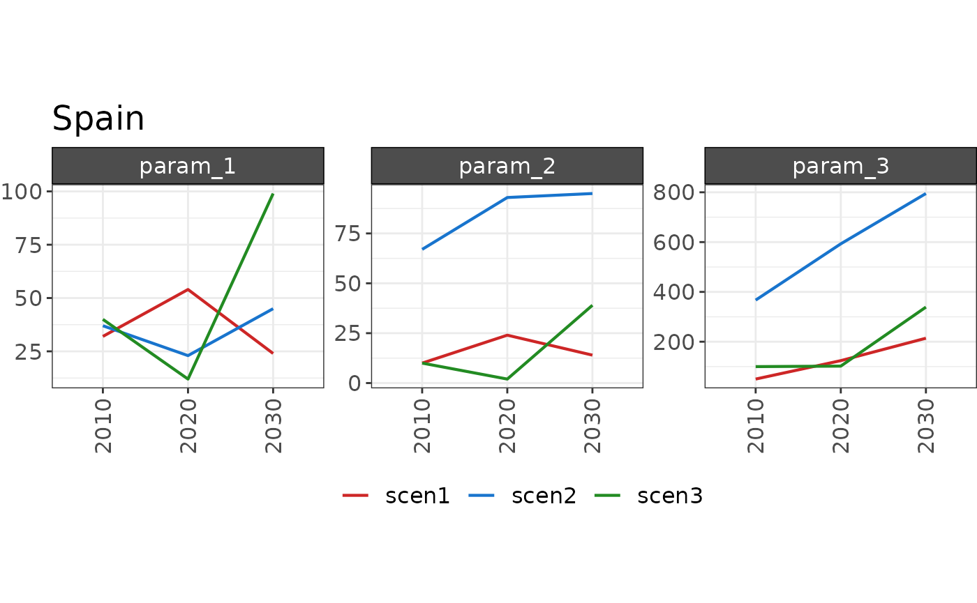
my_chart$chart_param_India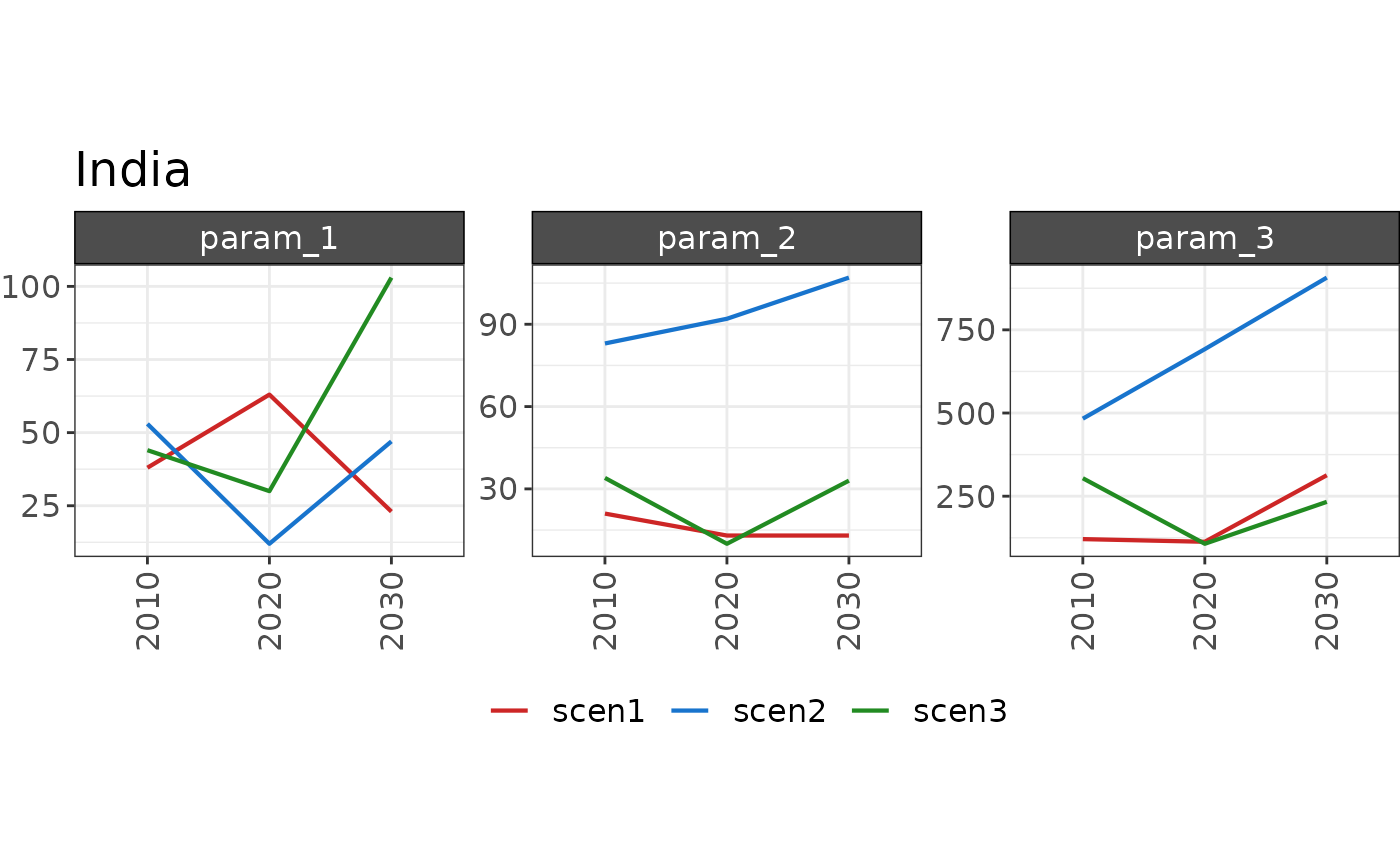
Plot Param Difference
Chart with params in each facet and multiple lines for each scenario.
Single Param Diff
library(rchart);
data = data.frame(scenario = c("scen1","scen1","scen1",
                               "scen2","scen2","scen2",
                               "scen3","scen3","scen3"),
                  year = rep(c(2010,2020,2030),3),
                  param = c(rep("param_1",9)),
                  value = c(32, 38, 54,
                            37, 53, 23,
                            40, 44, 12))

my_chart <- rchart::chart(data, save = F, scenRef="scen1") # So that all plots are not shown
my_chart$chart_param_diff_absolute # For just this chart rchart::chart(data, chart_type="param_diff_absolute")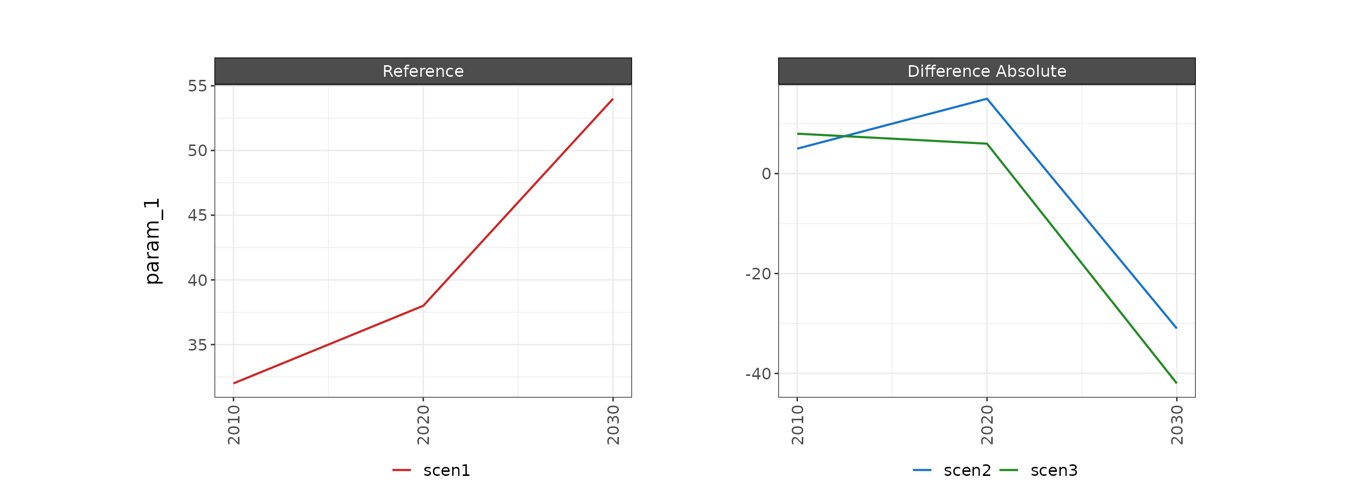
my_chart$chart_param_diff_percent # For just this chart rchart::chart(data, chart_type="param_diff_percent")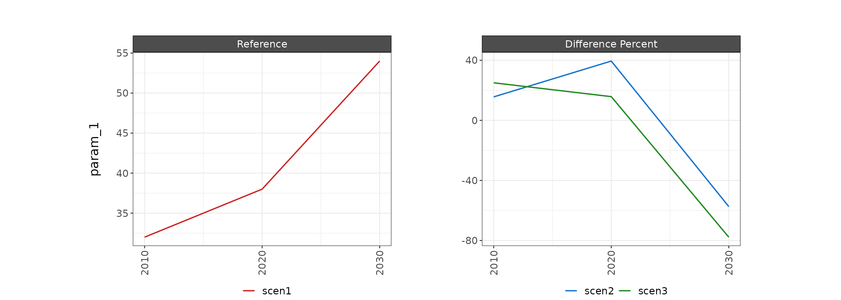
Multi Param Diff
library(rchart);
data = data.frame(scenario = rep(c("scen1","scen1","scen1",
                               "scen2","scen2","scen2",
                               "scen3","scen3","scen3"),3),
                  year = rep(rep(c(2010,2020,2030),3),3),
                  param = c(rep("param_1",9),
                            rep("param_2",9),
                            rep("param_3",9)),
                  value = c(c(32, 38, 54,
                              37, 53, 23,
                              40, 44, 12),
                            c(10, 21, 24,
                              67, 83, 93,
                              10, 34, 02),
                            c(50, 121, 124,
                              367, 483, 593,
                              100, 304, 102)))

my_chart <- rchart::chart(data, save = F, scenRef="scen1") # So that all plots are not shown
my_chart$chart_param_diff_absolute # For just this chart rchart::chart(data, scenRef = "scen1", chart_type="param_diff_absolute")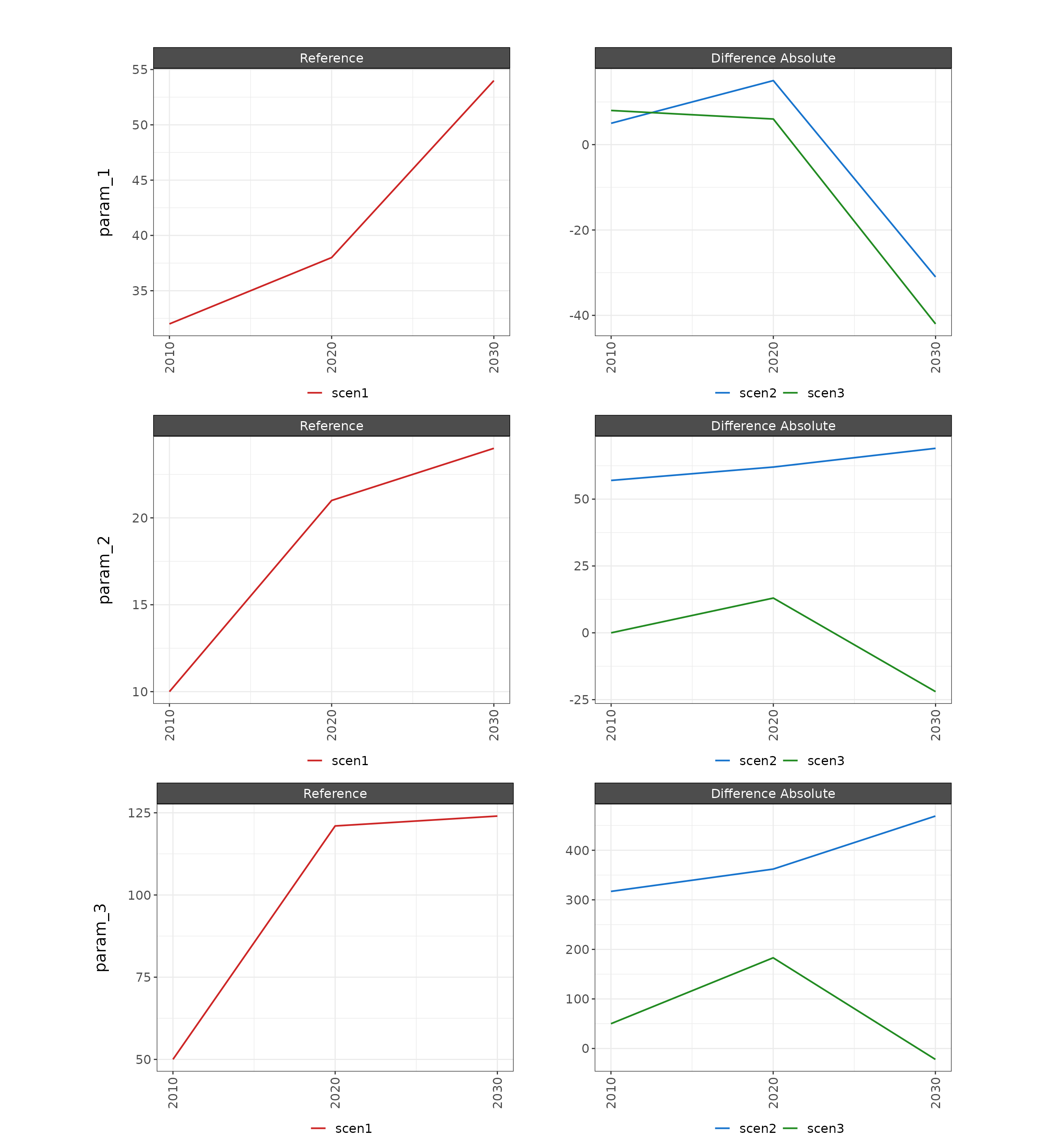
my_chart$chart_param_diff_percent # For just this chart rchart::chart(data, scenRef = "scen1", chart_type="param_diff_percent")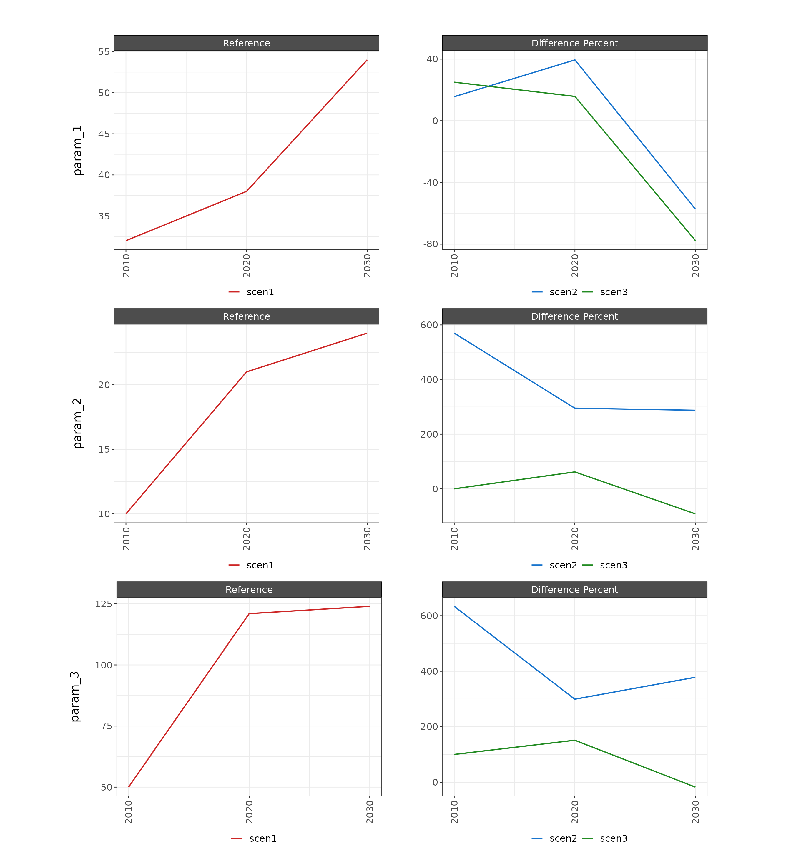
Multi Param & Region Diff
library(rchart);
data = data.frame(region = rep(c("Spain", "India","Spain", "India","Spain", "India",
                                "Spain", "India","Spain", "India","Spain", "India",
                                "Spain", "India","Spain", "India","Spain", "India"),3),
                  scenario = rep(c("scen1","scen1","scen1","scen1","scen1","scen1",
                               "scen2","scen2","scen2","scen2","scen2","scen2",
                               "scen3","scen3","scen3","scen3","scen3","scen3"),3),
                  year = rep(rep(c(2010,2010,2020,2020,2030,2030),3),3),
                  param = c(rep("param_1",18),
                            rep("param_2",18),
                            rep("param_3",18)),
                  value = c(c(32, 38, 54, 63, 24, 23,
                              37, 53, 23, 12, 45, 47,
                              40, 44, 12, 30, 99, 103),
                            c(10, 21, 24, 13, 14, 13,
                              67, 83, 93, 92, 95, 107,
                              10, 34, 02, 10, 39, 33),
                            c(50, 121, 124, 113, 214, 313,
                              367, 483, 593, 692, 795, 907,
                              100, 304, 102, 107, 339, 233)))

my_chart <- rchart::chart(data,save = F, scenRef="scen1") # So that all plots are not shown
# For just these charts rchart::chart(data, scenRef = "scen1", chart_type="param_diff_absolute")
# For just these charts rchart::chart(data, scenRef = "scen1", chart_type="param_diff_percent")
my_chart$chart_param_diff_absolute_Spain 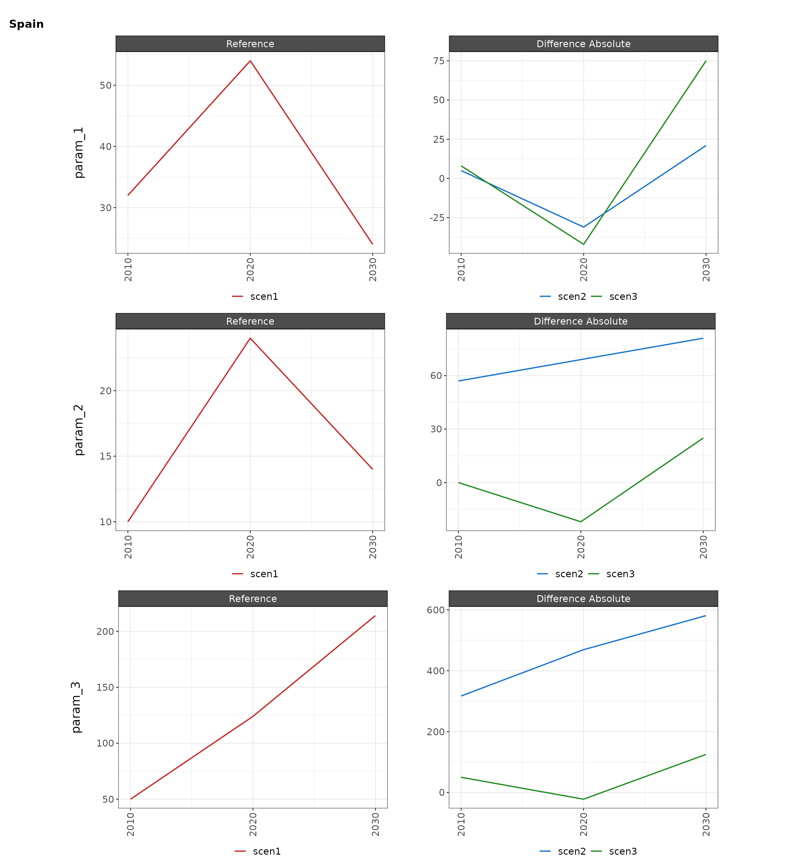
my_chart$chart_param_diff_absolute_India 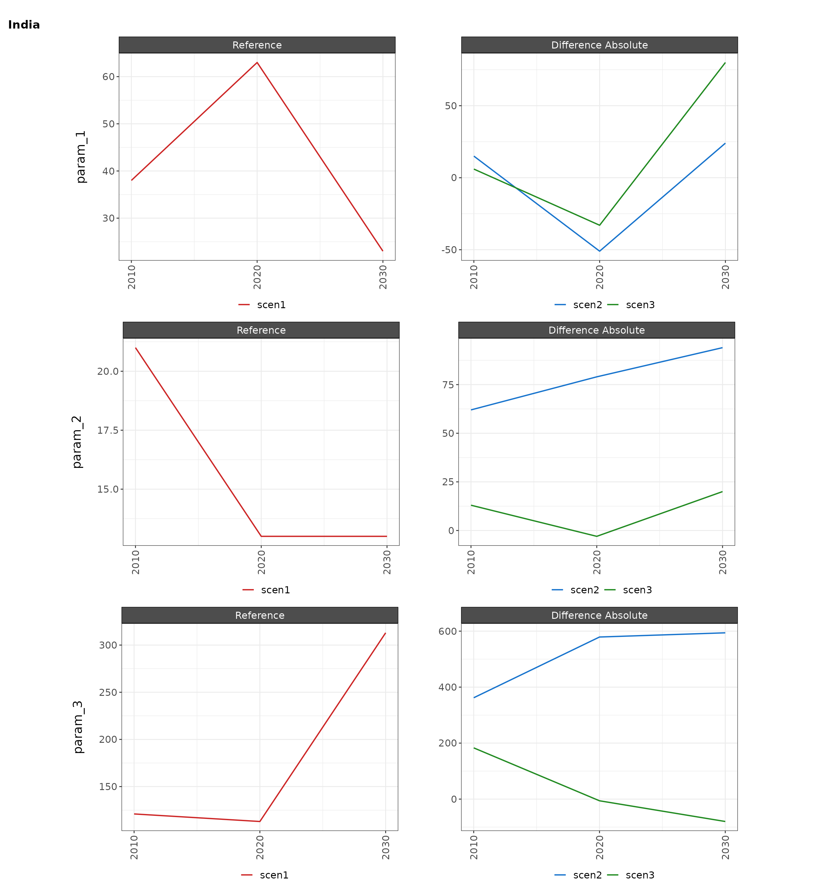
my_chart$chart_param_diff_percent_Spain 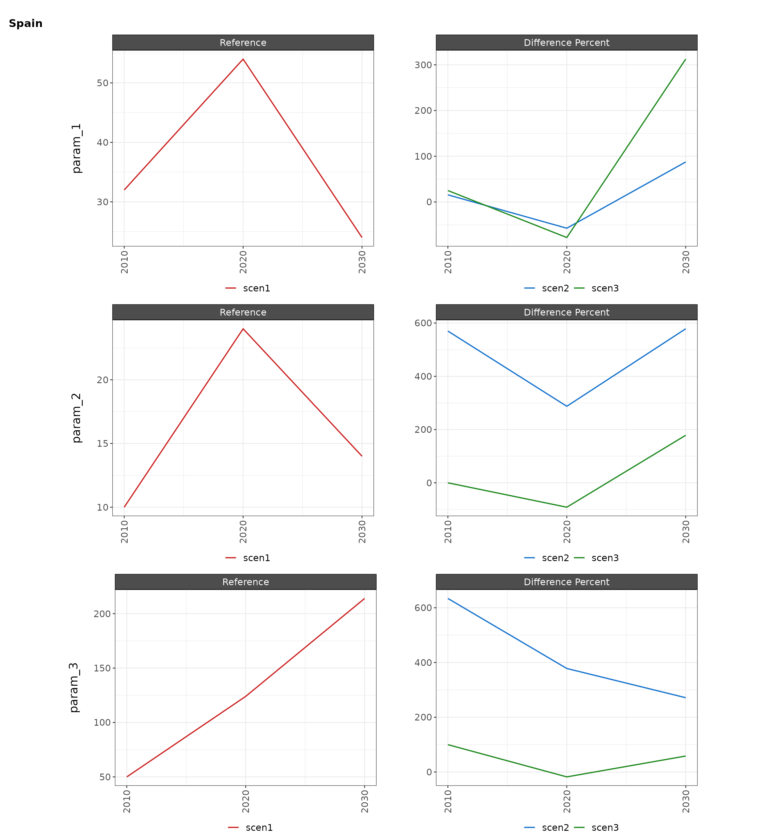
my_chart$chart_param_diff_percent_India 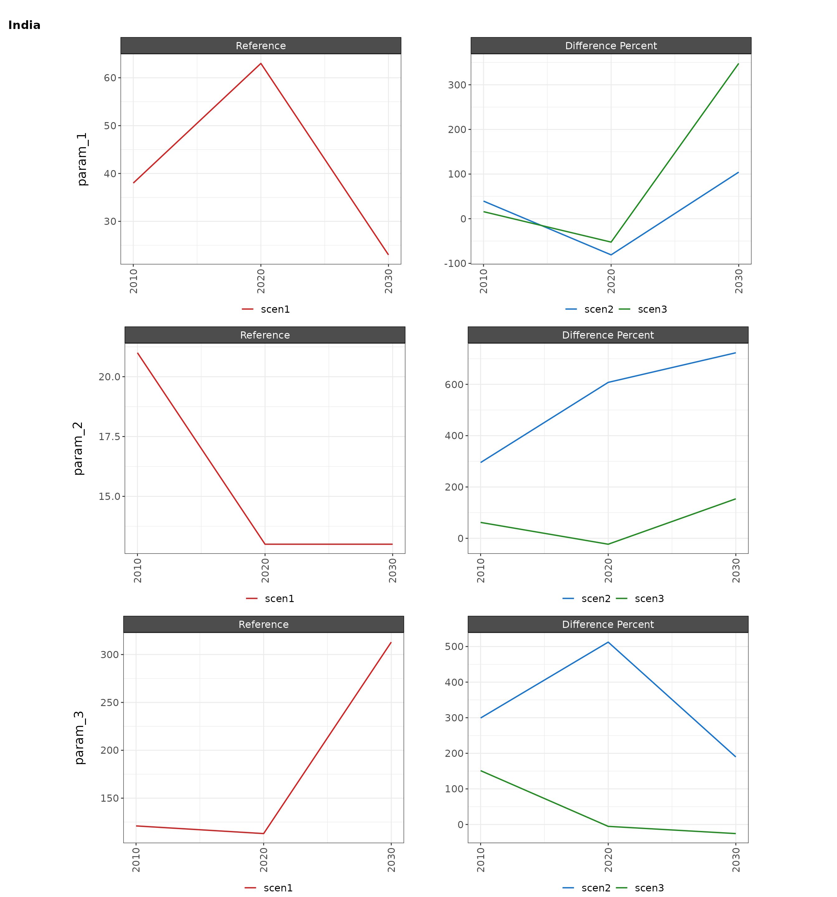
Plot Class Absolute
Chart with params in each facet and multiple lines for each scenario.
Multi Class Single Param
library(rchart);
data = data.frame(scenario = rep(c("scen1","scen1","scen1",
                               "scen2","scen2","scen2",
                               "scen3","scen3","scen3"),3),
                  year = rep(rep(c(2010,2020,2030),3),3),
                  class = c(rep("class_1",9),
                            rep("class_2",9),
                            rep("class_3",9)),
                  param = rep("param_1", 27),
                  value = c(c(32, 38, 54,
                              37, 53, 23,
                              40, 44, 12),
                            c(10, 21, 24,
                              67, 83, 93,
                              10, 34, 02),
                            c(50, 121, 124,
                              367, 483, 593,
                              100, 304, 102)))

my_chart <- rchart::chart(data, save = F)
my_chart$chart_class # For just this chart rchart::chart(data, chart_type="class_absolute")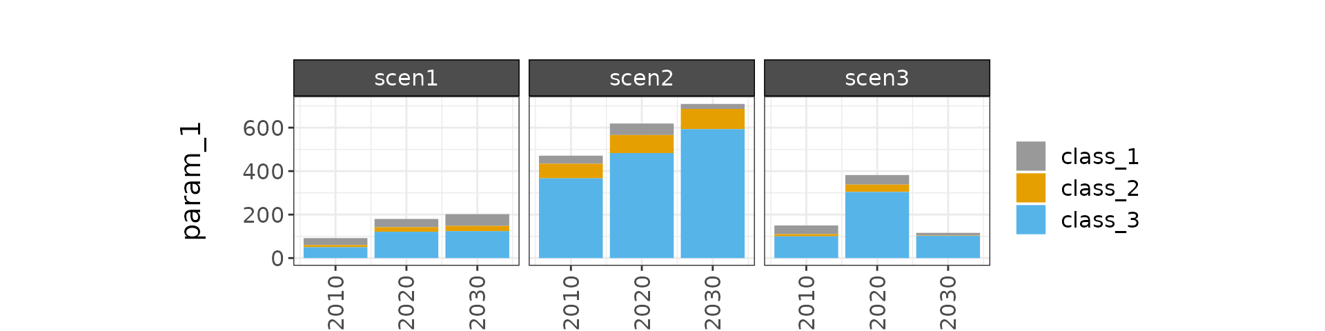
Multi Class Multi Param
library(rchart);
data = data.frame(param = rep(c("param_1", "param_2","param_1", "param_2","param_1", "param_2",
                                "param_1", "param_2","param_1", "param_2","param_1", "param_2",
                                "param_1", "param_2","param_1", "param_2","param_1", "param_2"),3),
                  scenario = rep(c("scen1","scen1","scen1","scen1","scen1","scen1",
                               "scen2","scen2","scen2","scen2","scen2","scen2",
                               "scen3","scen3","scen3","scen3","scen3","scen3"),3),
                  year = rep(rep(c(2010,2010,2020,2020,2030,2030),3),3),
                  class = c(rep("class_1",18),
                            rep("class_2",18),
                            rep("class_3",18)),
                  value = c(c(32, 138, 54, 163, 24, 123,
                              37, 153, 23, 112, 45, 147,
                              40, 144, 12, 130, 99, 1103),
                            c(10, 121, 24, 113, 14, 113,
                              67, 183, 93, 192, 95, 1107,
                              10, 134, 02, 110, 39, 133),
                            c(50, 1121, 124, 1113, 214, 1313,
                              367, 1483, 593, 1692, 795, 1907,
                              100, 1304, 102, 1107, 339, 1233)))

my_chart <- rchart::chart(data)
my_chart$chart_class  # For just this chart rchart::chart(data, chart_type="class_absolute")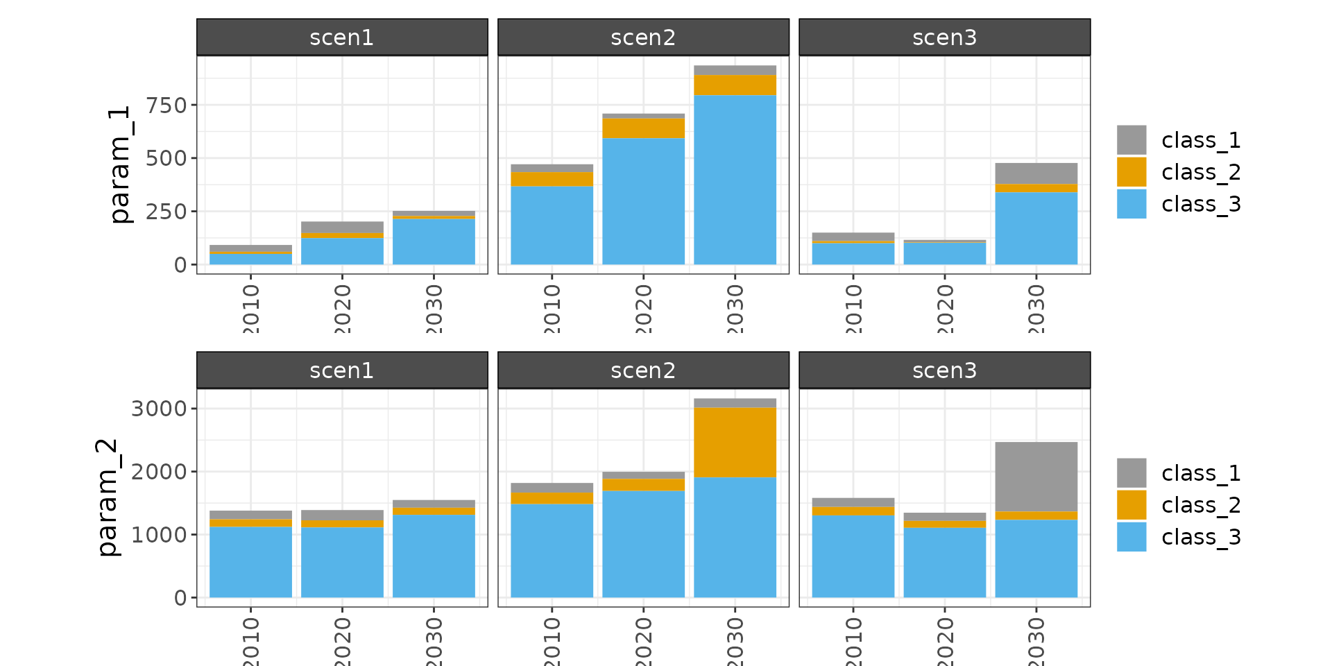
Multi Class Multi Param Multi Region
library(rchart);
data = data.frame(region = c(rep("Spain",54),
                             rep("India",54)),
                  param = rep(rep(c("param_1", "param_2","param_1", "param_2","param_1", "param_2",
                                "param_1", "param_2","param_1", "param_2","param_1", "param_2",
                                "param_1", "param_2","param_1", "param_2","param_1", "param_2"),3),2),
                  scenario = rep(rep(c("scen1","scen1","scen1","scen1","scen1","scen1",
                               "scen2","scen2","scen2","scen2","scen2","scen2",
                               "scen3","scen3","scen3","scen3","scen3","scen3"),3),2),
                  year = rep(rep(rep(c(2010,2010,2020,2020,2030,2030),3),3),2),
                  class = rep(c(rep("class_1",18),
                            rep("class_2",18),
                            rep("class_3",18)),2),
                  value = rep(c(c(32, 138, 54, 163, 24, 123,
                              37, 153, 23, 112, 45, 147,
                              40, 144, 12, 130, 99, 1103),
                            c(10, 121, 24, 113, 14, 113,
                              67, 183, 93, 192, 95, 1107,
                              10, 134, 02, 110, 39, 133),
                            c(50, 1121, 124, 1113, 214, 1313,
                              367, 1483, 593, 1692, 795, 1907,
                              100, 1304, 102, 1107, 339, 1233)),2))

my_chart <- rchart::chart(data) # For just this chart rchart::chart(data, chart_type="class_absolute")
my_chart$chart_class_Spain 
my_chart$chart_class_India
my_chart$chart_class_scen1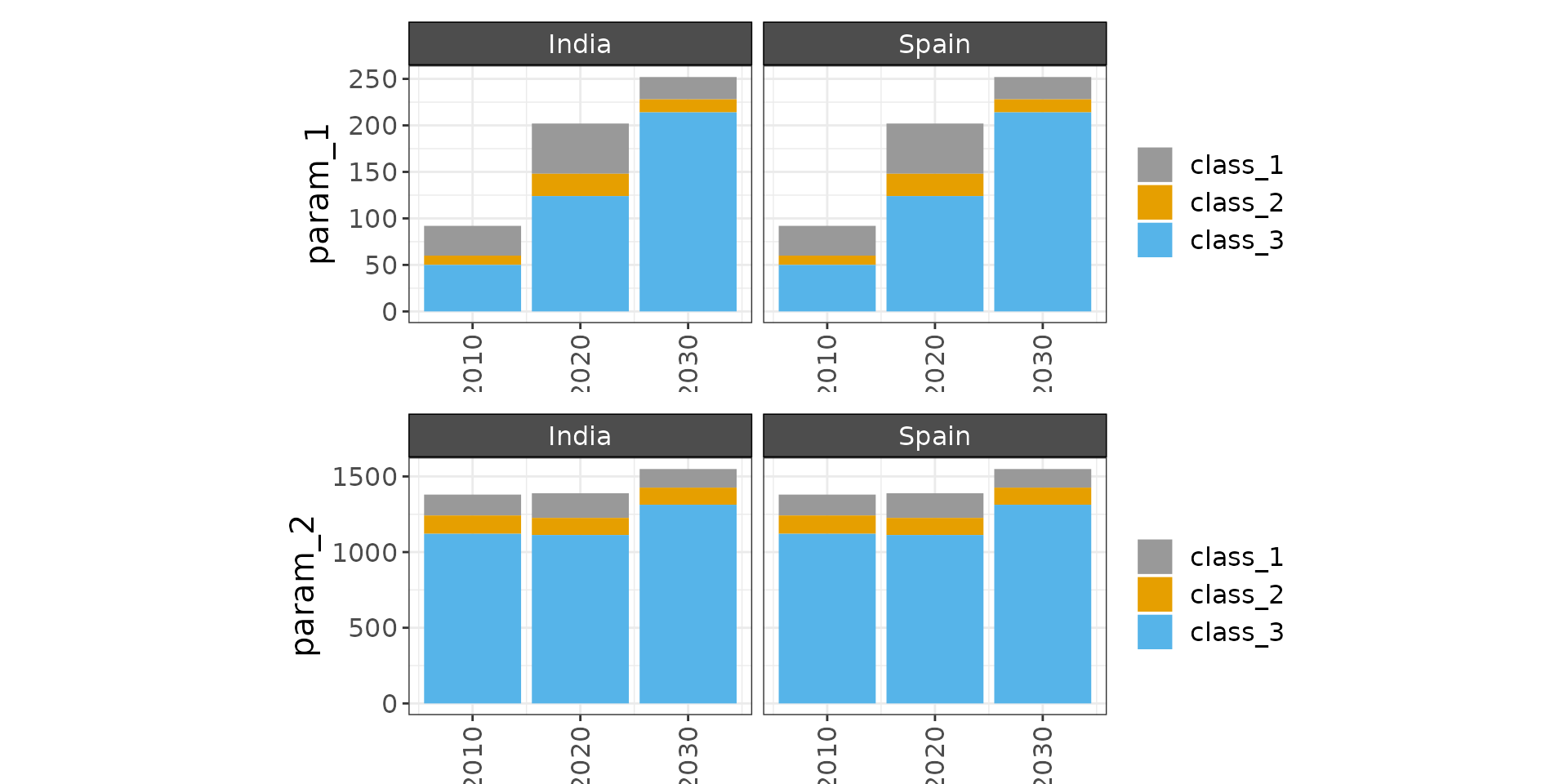
my_chart$chart_class_scen2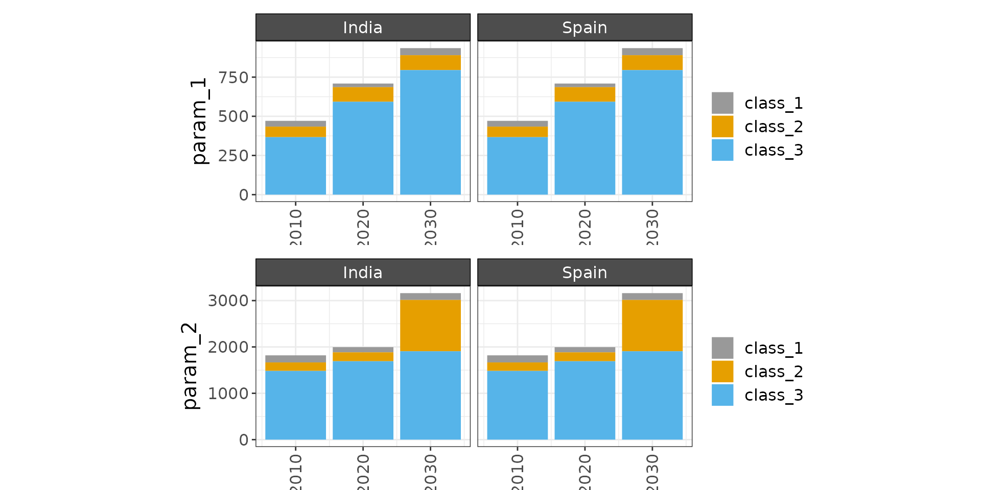
my_chart$chart_class_scen3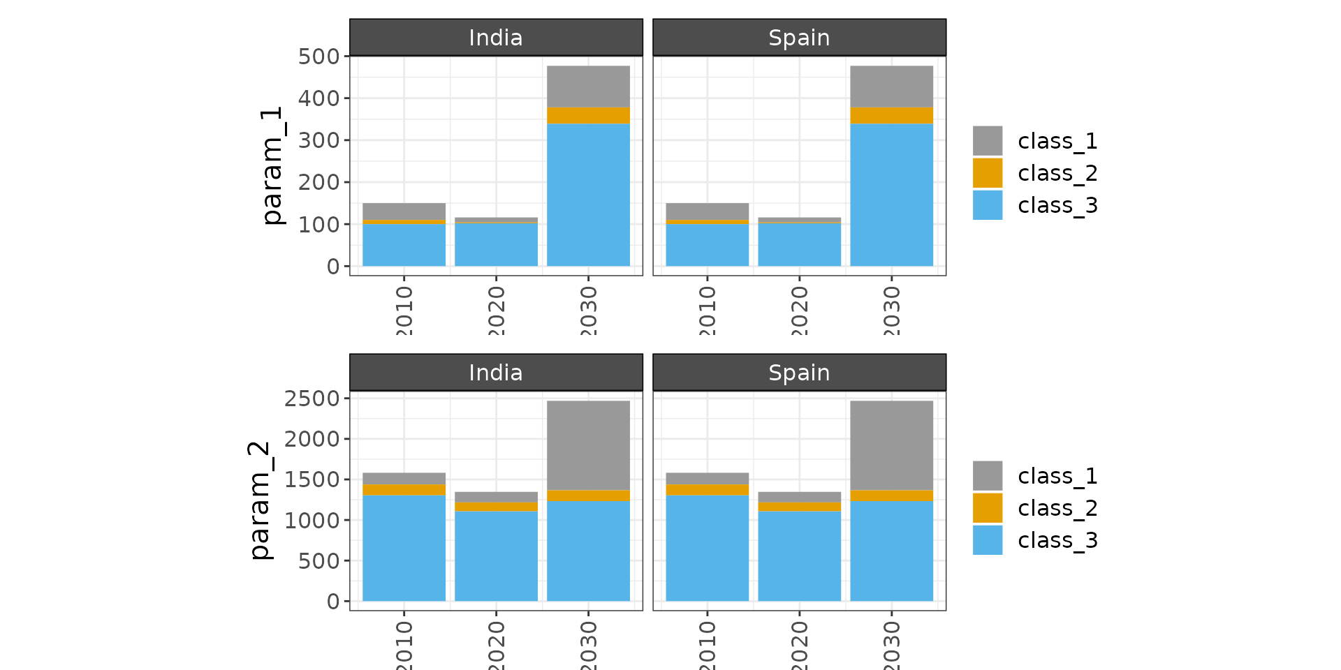
Plot Class Difference
Chart with params in each facet and multiple lines for each scenario.
Multi Class Single Param Diff
library(rchart);
data = data.frame(scenario = rep(c("scen1","scen1","scen1",
                               "scen2","scen2","scen2",
                               "scen3","scen3","scen3"),3),
                  year = rep(rep(c(2010,2020,2030),3),3),
                  class = c(rep("class_1",9),
                            rep("class_2",9),
                            rep("class_3",9)),
                  value = c(c(32, 38, 54,
                              37, 53, 23,
                              40, 44, 12),
                            c(10, 21, 24,
                              67, 83, 93,
                              10, 34, 02),
                            c(50, 121, 124,
                              367, 483, 593,
                              100, 304, 102)))

my_chart <- rchart::chart(data, save = F, scenRef = "scen1")
my_chart$chart_class_diff_absolute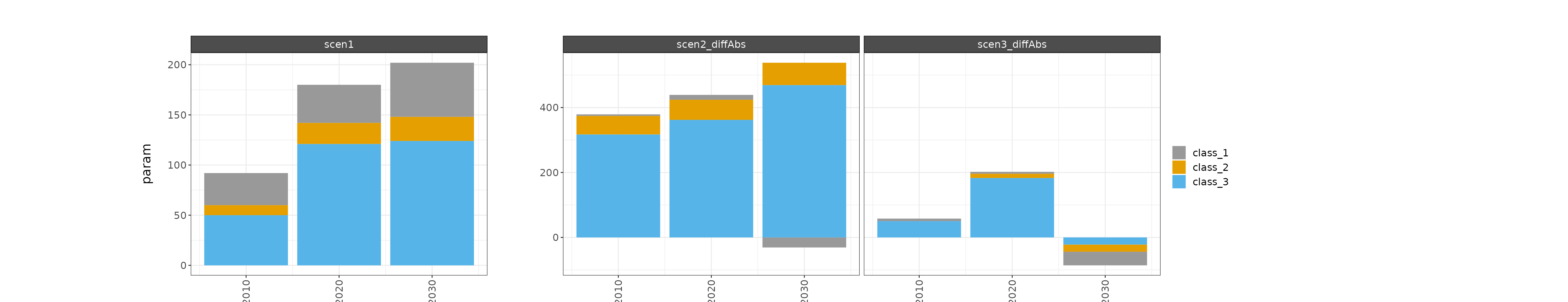
my_chart$chart_class_diff_percent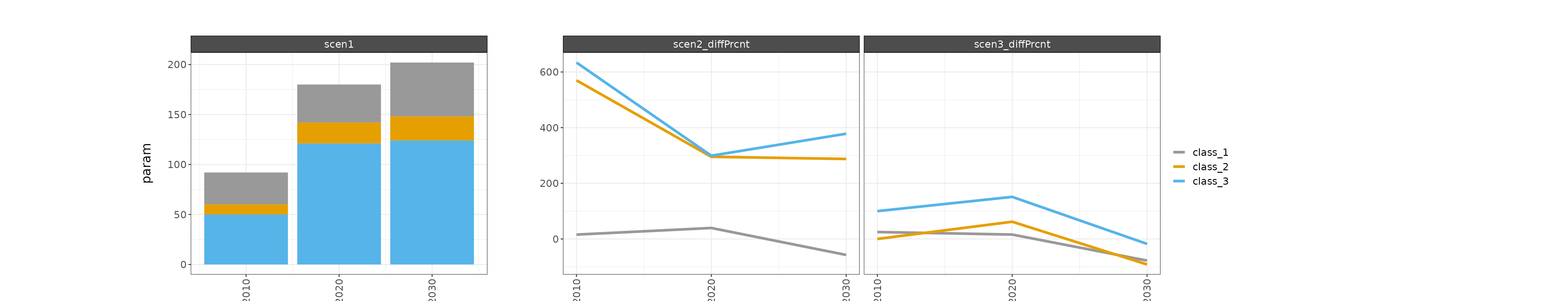
Multi Class Multi Param Diff
library(rchart);
data = data.frame(param = rep(c("param_1", "param_2","param_1", "param_2","param_1", "param_2",
                                "param_1", "param_2","param_1", "param_2","param_1", "param_2",
                                "param_1", "param_2","param_1", "param_2","param_1", "param_2"),3),
                  scenario = rep(c("scen1","scen1","scen1","scen1","scen1","scen1",
                               "scen2","scen2","scen2","scen2","scen2","scen2",
                               "scen3","scen3","scen3","scen3","scen3","scen3"),3),
                  year = rep(rep(c(2010,2010,2020,2020,2030,2030),3),3),
                  class = c(rep("class_1",18),
                            rep("class_2",18),
                            rep("class_3",18)),
                  value = c(c(32, 138, 54, 163, 24, 123,
                              37, 153, 23, 112, 45, 147,
                              40, 144, 12, 130, 99, 1103),
                            c(10, 121, 24, 113, 14, 113,
                              67, 183, 93, 192, 95, 1107,
                              10, 134, 02, 110, 39, 133),
                            c(50, 1121, 124, 1113, 214, 1313,
                              367, 1483, 593, 1692, 795, 1907,
                              100, 1304, 102, 1107, 339, 1233)))

my_chart <- rchart::chart(data, save = F, scenRef = "scen1")
my_chart$chart_class_diff_absolute  # For just this chart rchart::chart(data, scenRef = "scen1", chart_type="class_absolute")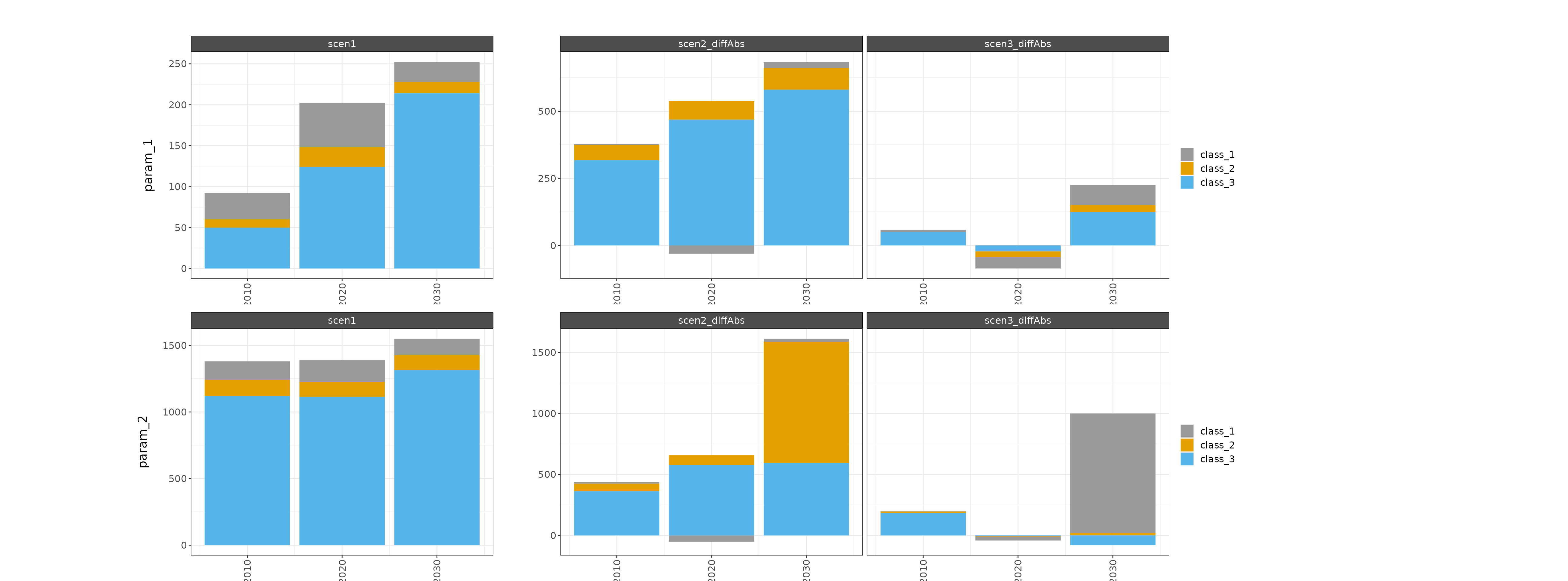
my_chart$chart_class_diff_percent # For just this chart rchart::chart(data, scenRef = "scen1", chart_type="class_percent")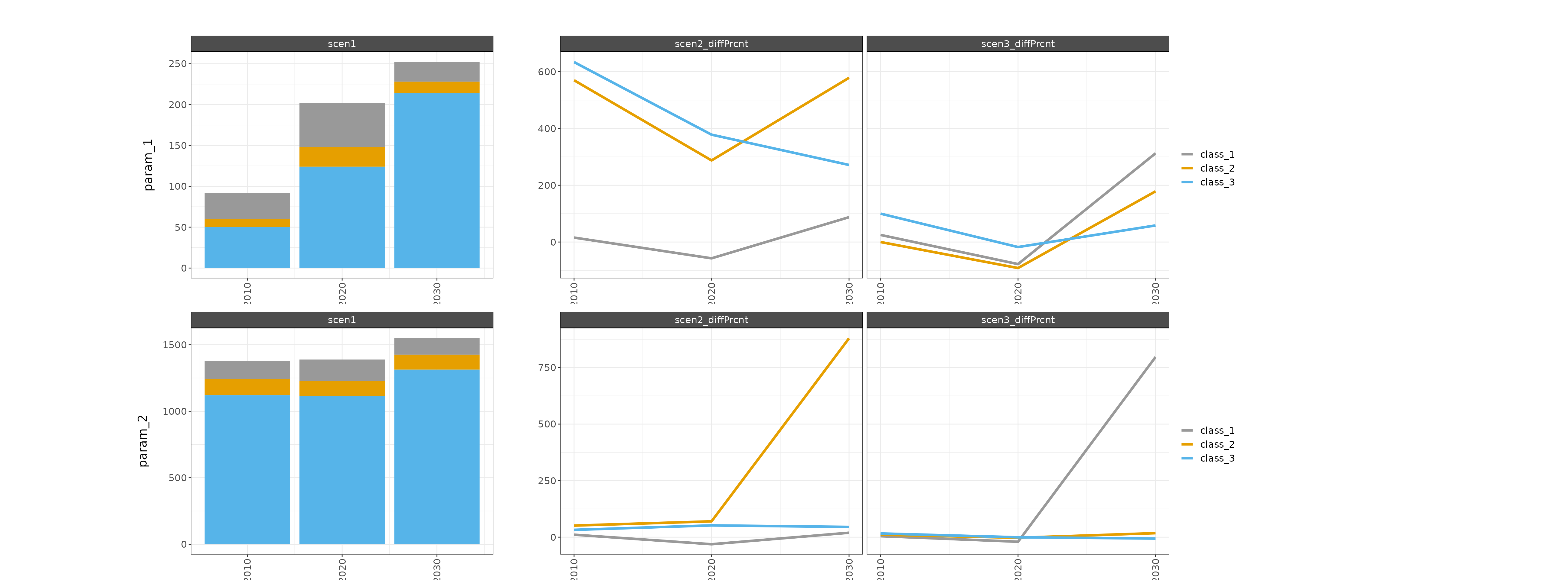
Multi Class Multi Param Multi Region
library(rchart);
data = data.frame(region = c(rep("Spain",54),
                             rep("India",54)),
                  param = rep(rep(c("param_1", "param_2","param_1", "param_2","param_1", "param_2",
                                "param_1", "param_2","param_1", "param_2","param_1", "param_2",
                                "param_1", "param_2","param_1", "param_2","param_1", "param_2"),3),2),
                  scenario = rep(rep(c("scen1","scen1","scen1","scen1","scen1","scen1",
                               "scen2","scen2","scen2","scen2","scen2","scen2",
                               "scen3","scen3","scen3","scen3","scen3","scen3"),3),2),
                  year = rep(rep(rep(c(2010,2010,2020,2020,2030,2030),3),3),2),
                  class = rep(c(rep("class_1",18),
                            rep("class_2",18),
                            rep("class_3",18)),2),
                  value = rep(c(c(32, 138, 54, 163, 24, 123,
                              37, 153, 23, 112, 45, 147,
                              40, 144, 12, 130, 99, 1103),
                            c(10, 121, 24, 113, 14, 113,
                              67, 183, 93, 192, 95, 1107,
                              10, 134, 02, 110, 39, 133),
                            c(50, 1121, 124, 1113, 214, 1313,
                              367, 1483, 593, 1692, 795, 1907,
                              100, 1304, 102, 1107, 339, 1233)),2))

my_chart <- rchart::chart(data, save = F, scenRef = "scen1")
# For just this chart rchart::chart(data, scenRef = "scen1", chart_type="class_absolute")
# For just this chart rchart::chart(data, scenRef = "scen1", chart_type="class_percent")
my_chart$chart_class_diff_absolute_Spain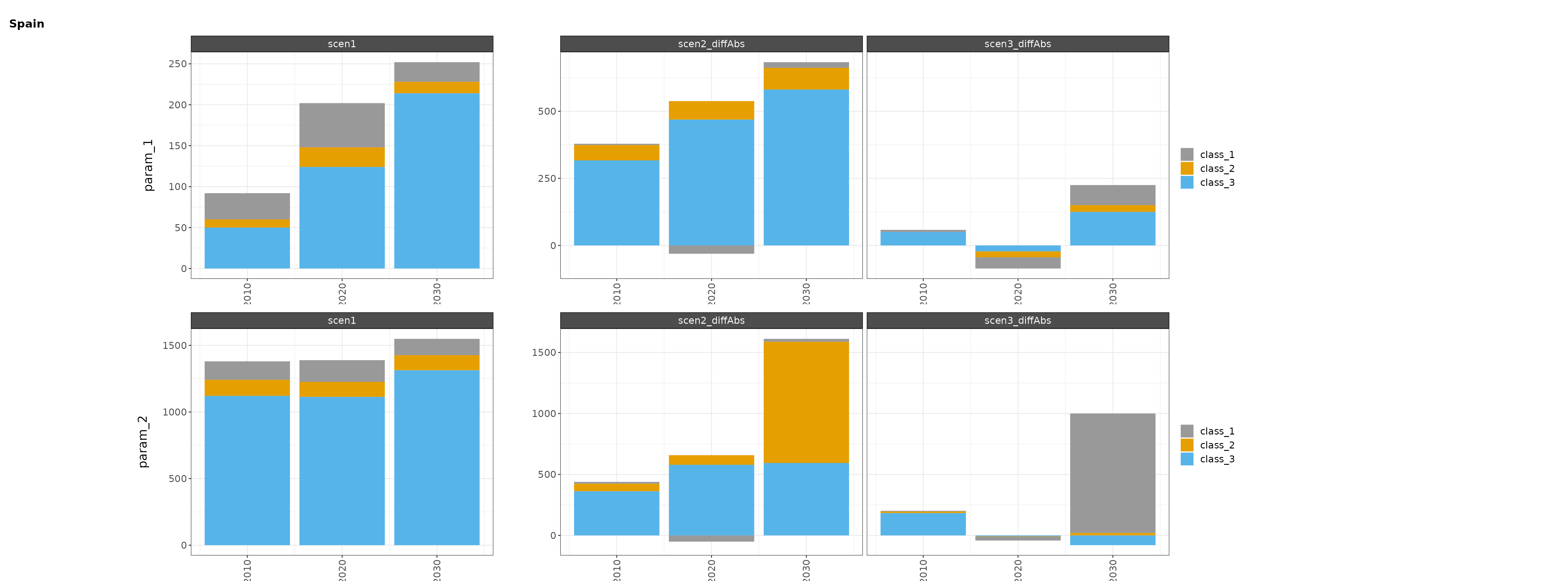
my_chart$chart_class_diff_absolute_India
my_chart$chart_class_diff_percent_Spain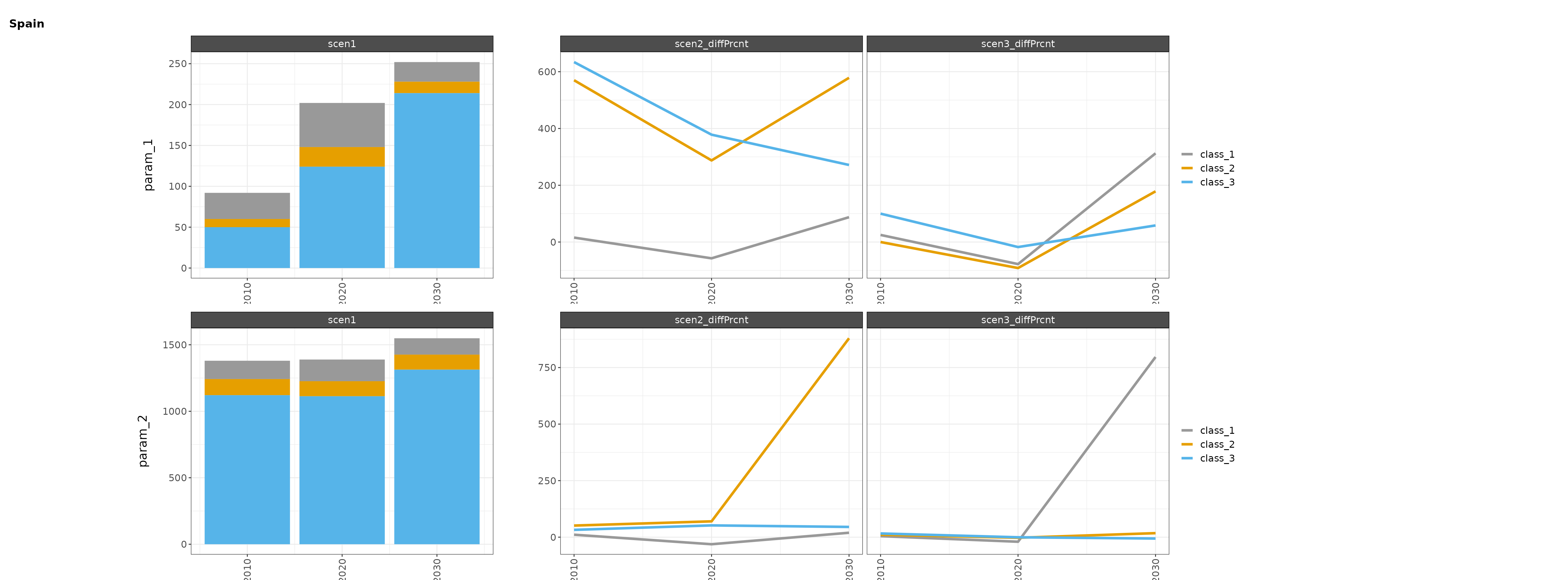
my_chart$chart_class_diff_percent_India
Plot Class Waterfall
This chart type creates a waterfall plot for a single year (or x value) comparing a reference scenario to difference scenario(s). The leftmost bar in the plot represents the parameter total for the reference scenario, the rightmost bar represents the parameter total for the difference scenario, and the middle rectangles represent the differences between the scenarios for each class. The default year is the latest one in the data (or largest x value), but a different year can be selected using the waterfall_x argument.
library(rchart);
data = data.frame(region = c(rep("Spain",54),
                             rep("India",54)),
                  param = rep(rep(c("param_1", "param_2","param_1", "param_2","param_1", "param_2",
                                "param_1", "param_2","param_1", "param_2","param_1", "param_2",
                                "param_1", "param_2","param_1", "param_2","param_1", "param_2"),3),2),
                  scenario = rep(rep(c("scen1","scen1","scen1","scen1","scen1","scen1",
                               "scen2","scen2","scen2","scen2","scen2","scen2",
                               "scen3","scen3","scen3","scen3","scen3","scen3"),3),2),
                  year = rep(rep(rep(c(2010,2010,2020,2020,2030,2030),3),3),2),
                  class = rep(c(rep("class_1",18),
                            rep("class_2",18),
                            rep("class_3",18)),2),
                  value = rep(c(c(32, 138, 54, 163, 24, 123,
                              37, 153, 23, 112, 45, 147,
                              40, 144, 12, 130, 99, 1103),
                            c(10, 121, 24, 113, 14, 113,
                              67, 183, 93, 192, 95, 1107,
                              10, 134, 02, 110, 39, 133),
                            c(50, 1121, 124, 1113, 214, 1313,
                              367, 1483, 593, 1692, 795, 1907,
                              100, 1304, 102, 1107, 339, 1233)),2))

my_chart <- rchart::chart(data, save = F, scenRef = "scen1") # For just this chart rchart::chart(data, chart_type="class_waterfall")
my_chart$chart_class_waterfall_Spain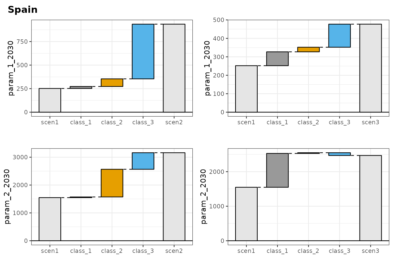
my_chart2 <- rchart::chart(data, save = F, scenRef = "scen1", waterfall_x = 2020)
my_chart2$chart_class_waterfall_India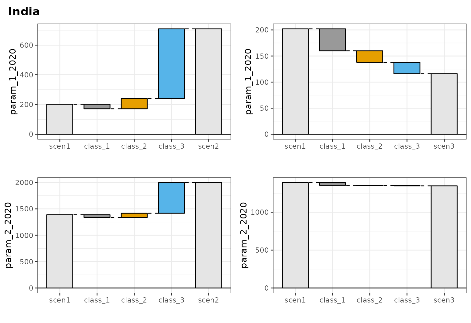
Plot Region Compare
To compare regions across scenarios and parameters.
library(rchart);
data = data.frame(region = rep(c("Spain", "India","Spain", "India","Spain", "India",
                                "Spain", "India","Spain", "India","Spain", "India",
                                "Spain", "India","Spain", "India","Spain", "India"),3),
                  scenario = rep(c("scen1","scen1","scen1","scen1","scen1","scen1",
                               "scen2","scen2","scen2","scen2","scen2","scen2",
                               "scen3","scen3","scen3","scen3","scen3","scen3"),3),
                  year = rep(rep(c(2010,2010,2020,2020,2030,2030),3),3),
                  param = c(rep("param_1",18),
                            rep("param_2",18),
                            rep("param_3",18)),
                  value = c(c(32, 38, 54, 63, 24, 23,
                              37, 53, 23, 12, 45, 47,
                              40, 44, 12, 30, 99, 103),
                            c(10, 21, 24, 13, 14, 13,
                              67, 83, 93, 92, 95, 107,
                              10, 34, 02, 10, 39, 33),
                            c(50, 121, 124, 113, 214, 313,
                              367, 483, 593, 692, 795, 907,
                              100, 304, 102, 107, 339, 233)))

my_chart <- rchart::chart(data, save = F) # For just this chart rchart::chart(data, chart_type="region_absolute")
my_chart$chart_region_absolute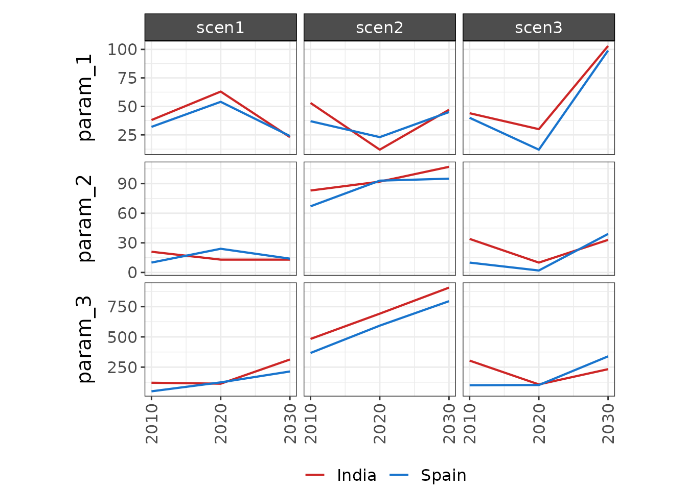
Other Plotting Options
Custom color palettes
Custom color palettes can be applied to line, bar, and waterfall charts using the palette argument, which is given as a named vector. Any color or fill aesthetics (scenario, region, class) can be included in the custom palette and the relevant colors will be applied to each plot.
library(rchart);
data = data.frame(region = c(rep("Spain",27),
                             rep("India",27)),
                  param = rep("param_1", 54),
                  scenario = rep(rep(c("scen1","scen1","scen1",
                               "scen2","scen2","scen2",
                               "scen3","scen3","scen3"),3),2),
                  year = rep(rep(rep(c(2010,2020,2030),3),3),2),
                  class = rep(c(rep("class_1",9),
                            rep("class_2",9),
                            rep("class_3",9)),2),
                  value = c(c(32, 54, 24, 37, 23, 45,40, 12, 99),
                            c(10, 24, 14, 67, 93, 95, 10, 02, 39),
                            c(50, 124, 214, 367, 593, 795, 100, 102, 339),
                            c(16, 60, 24, 27, 40, 15, 20, 30, 80),
                            c(5, 12, 14, 70, 100, 75, 20, 10, 30),
                            c(45, 120, 200, 400, 450, 400, 100, 135, 375)))

pal <- c("class_1" = "orange", "class_2" = "skyblue", "class_3" = "forestgreen",
         "scen1" = "coral", "scen2" = "darkblue", "scen3" = "grey",
         "Spain" = "darkgoldenrod2", "India" = "lightslateblue")

my_chart <- rchart::chart(data, save = F, scenRef = "scen1", palette = pal)
my_chart$chart_param_Spain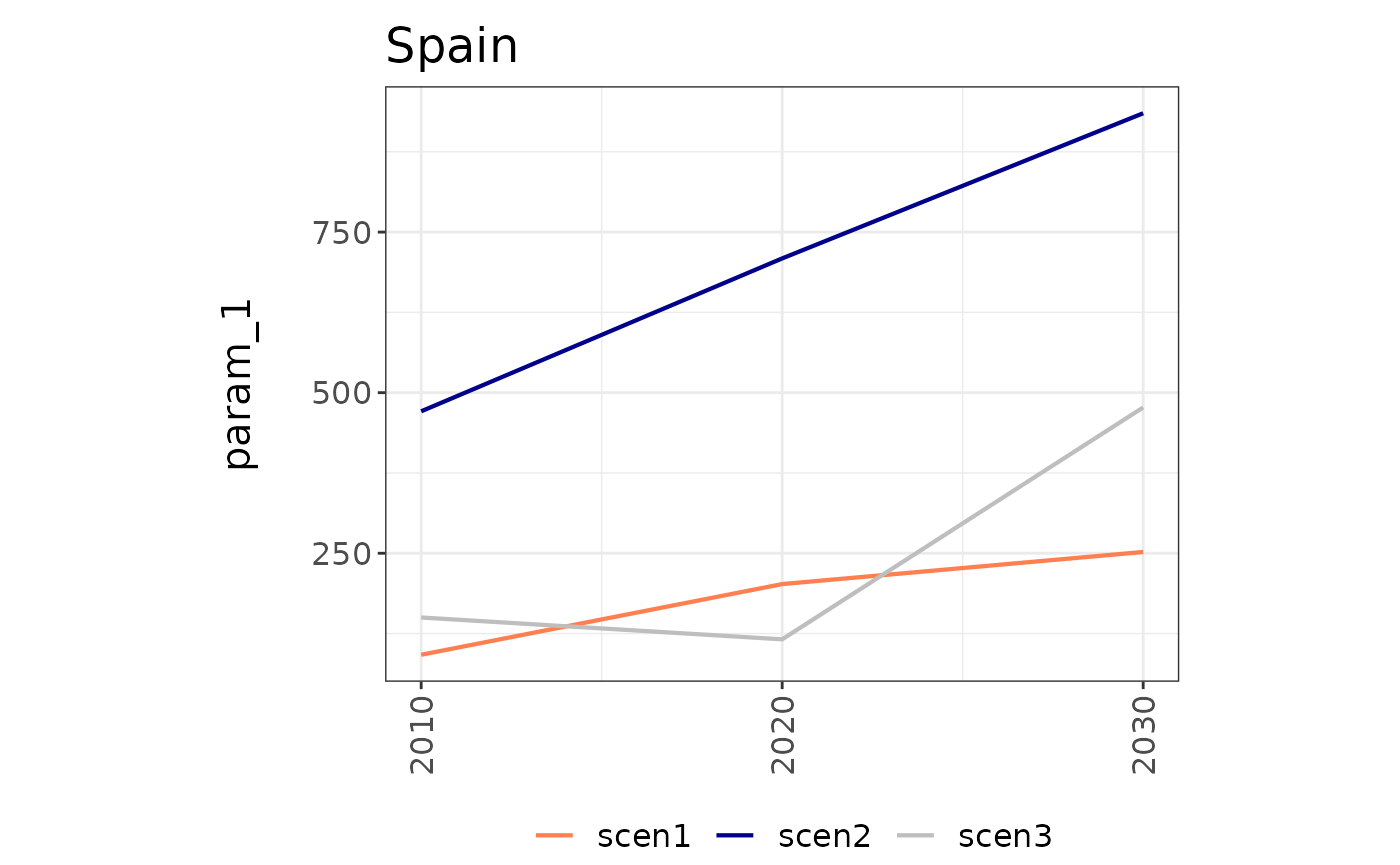
my_chart$chart_class_India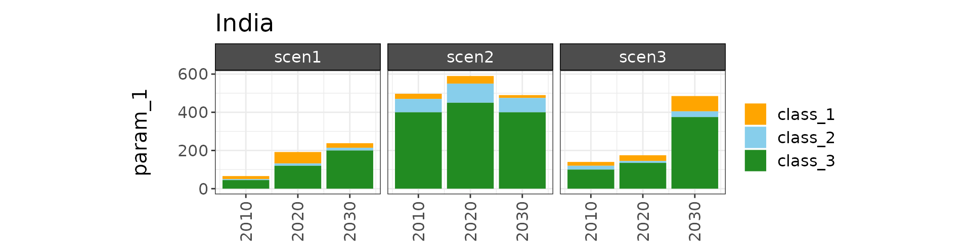
my_chart$chart_class_diff_percent_India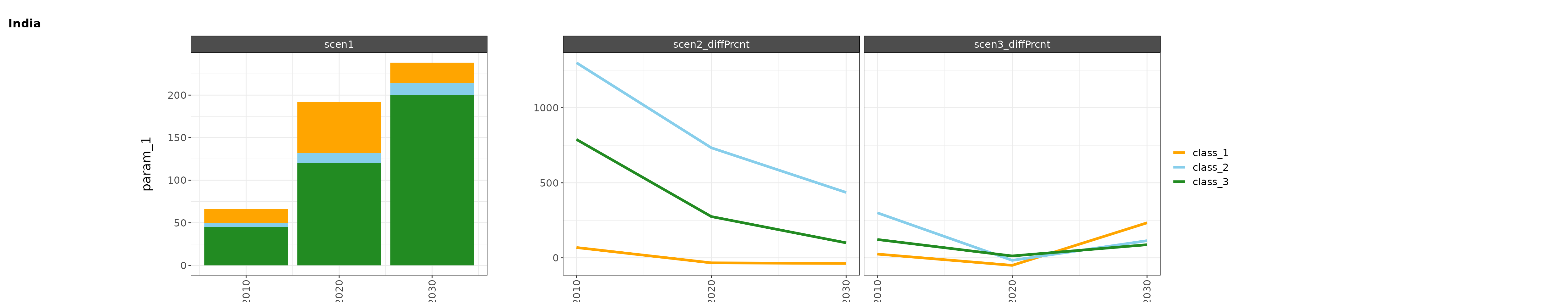
my_chart$chart_class_waterfall_India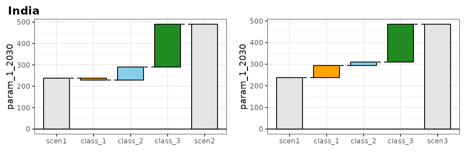
my_chart$chart_region_absolute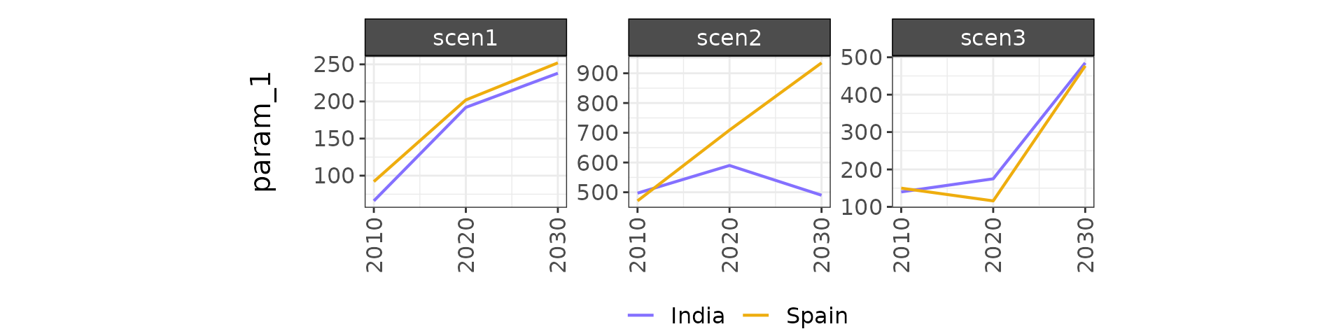
Add summary line to bar charts
The summary_line argument can be used to overlay a parameter summary line over bar charts. This is especially useful for barcharts that include both positive and negative values. Setting summary_line = T will add summary lines to all bar charts generated, including diff charts.
library(rchart);
data = data.frame(scenario = rep(c("scen1","scen1","scen1",
                               "scen2","scen2","scen2",
                               "scen3","scen3","scen3"),3),
                  year = rep(rep(c(2010,2020,2030),3),3),
                  class = c(rep("class_1",9),
                            rep("class_2",9),
                            rep("class_3",9)),
                  param = rep("param_1", 27),
                  value = c(c(32, 38, 54,
                              37, 53, 23,
                              40, 44, 12),
                            c(-10, -21, -24,
                              -67, -83, -93,
                              -10, -34, -02),
                            c(50, 121, 124,
                              367, 483, 593,
                              100, 304, 102)))

my_chart <- rchart::chart(data, save = F, summary_line = T)
my_chart$chart_class # For just this chart rchart::chart(data, chart_type="class_absolute")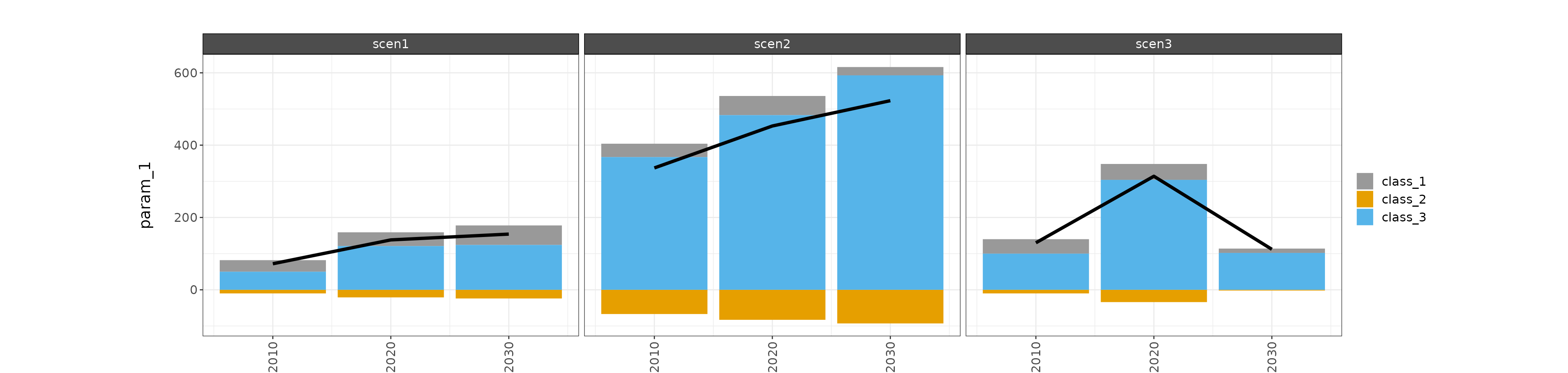
library(rchart);
data = data.frame(scenario = rep(c("scen1","scen1","scen1",
                               "scen2","scen2","scen2",
                               "scen3","scen3","scen3"),3),
                  year = rep(rep(c(2010,2020,2030),3),3),
                  class = c(rep("class_1",9),
                            rep("class_2",9),
                            rep("class_3",9)),
                  value = c(c(32, 38, 54,
                              37, 53, 23,
                              40, 44, 12),
                            c(-10, -21, -24,
                              -67, -83, -93,
                              -10, -34, -02),
                            c(50, 121, 124,
                              367, 483, 593,
                              100, 304, 102)))

my_chart <- rchart::chart(data, save = F, scenRef = "scen1", summary_line = T)
my_chart$chart_class_diff_absolute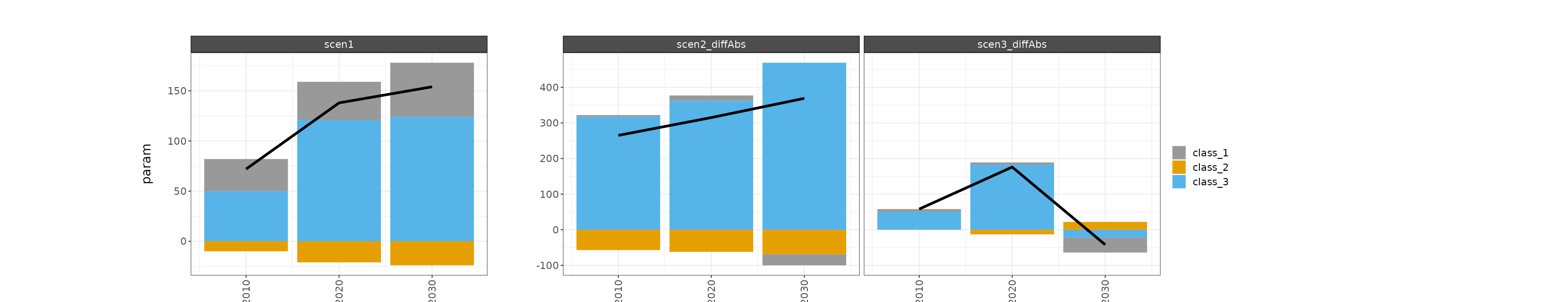
my_chart$chart_class_diff_percent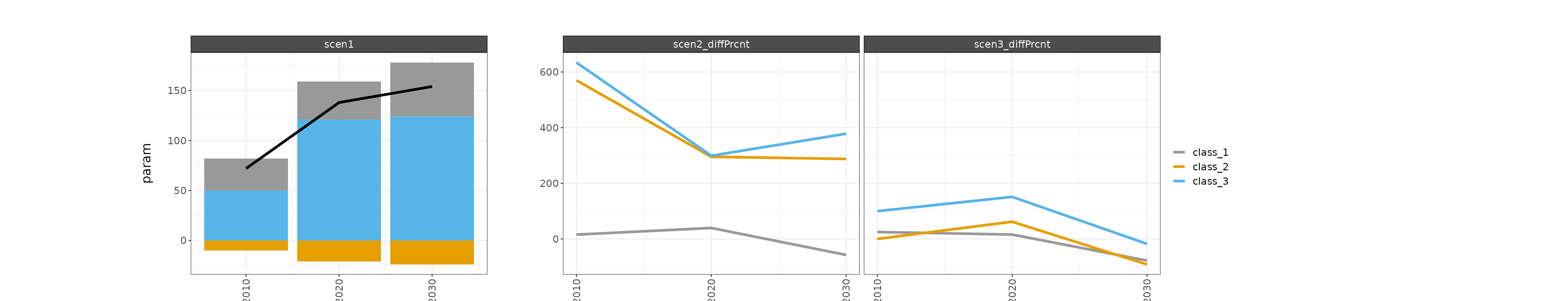
Add points to line charts
Points can be added to line charts with the include_points argument. The default, include_points = F displays only lines for relevant chart types (chart_param, chart_param_diff_absolute, chart_param_diff_percent, chart_class_diff_percent, and plot_region_absolute), while setting include_points = T results in plots with both lines and points for these chart types.
library(rchart);
data = data.frame(scenario = c("scen1","scen1","scen1",
                               "scen2","scen2","scen2",
                               "scen3","scen3","scen3"),
                  year = rep(c(2010, 2020, 2030), times = 3),
                  param = c(rep("param_1",9)),
                  value = c(32, 38, 54,
                            37, 53, 23,
                            40, 44, 12))

my_chart <- rchart::chart(data, save = F, include_points = T)
my_chart$chart_param 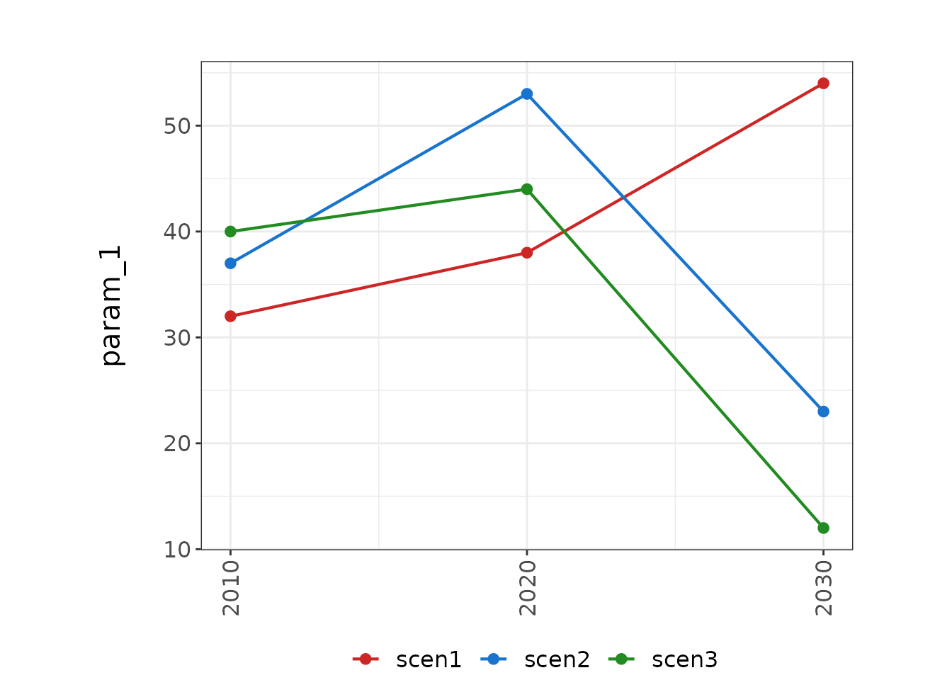
Interactions: lty and color
Users can choose columns to show interactions by line type and color (interaction_col_lty and interaction_col_color).
library(rchart);
data = data.frame(scenario = c("scen1a","scen1a","scen1a",
                               "scen1b","scen1b","scen1b",
                               "scen2a","scen2a","scen2a",
                               "scen2b","scen2b","scen2b"),
                  year = rep(c(2010, 2020, 2030), times = 4),
                  param = c(rep("param_1",12)),
                  value = c(32, 38, 54,
                            37, 53, 23,
                            40, 44, 12,
                            30, 23, 11),
                  type_num = c(rep(1,6),rep(2,6)),
                  type_letter = c(rep("a",3),rep("b",3),rep("a",3),rep("b",3)))

my_chart <- rchart::chart(data, save = F, interaction_col_lty = "type_num", interaction_col_color="type_letter")
my_chart$chart_param 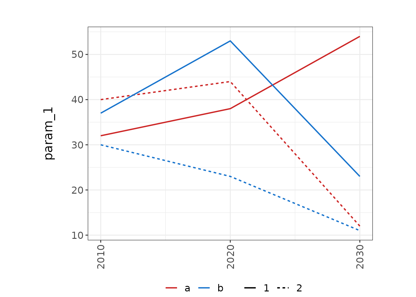
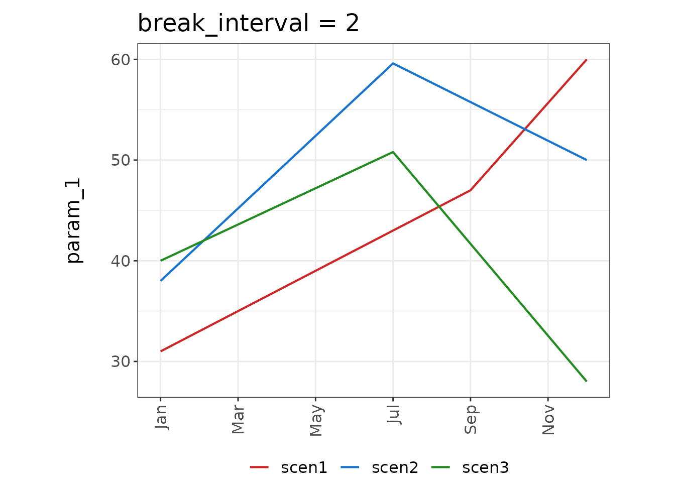
Non-numeric X-Axis data
If non-numeric x-axis data are provided, the spacing of x-axis breaks can be modified as shown by the following examples. The default displays all breaks, i.e. each x-axis value included in data. The break_interval argument sets the interval between breaks.
library(rchart)
data = data.frame(scenario = c(rep("scen1", times = 12),
                               rep("scen2", times = 12),
                               rep("scen3", times = 12)),
                  year = rep(c("Jan", "Feb", "Mar", "Apr", "May", "Jun", "Jul",
                               "Aug", "Sep", "Oct", "Nov", "Dec"),3),
                  param = c(rep("param_1",36)),
                  value = c(seq(31,45,length.out = 8), seq(47,60, length.out = 4),
                            seq(38,56,length.out = 6), seq(59.6,50, length.out = 6),
                            seq(40,49,length.out = 6), seq(50.8,28, length.out = 6)))

my_chart <- rchart::chart(data)
my_chart_breaks <- rchart::chart(data, break_interval = 2)

my_chart$chart_param + ggplot2::ggtitle("Default: All Breaks")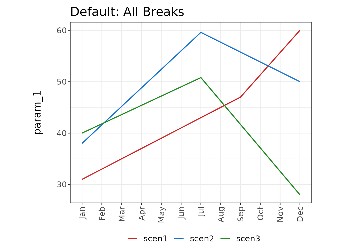
my_chart_breaks$chart_param + ggplot2::ggtitle("break_interval = 2")