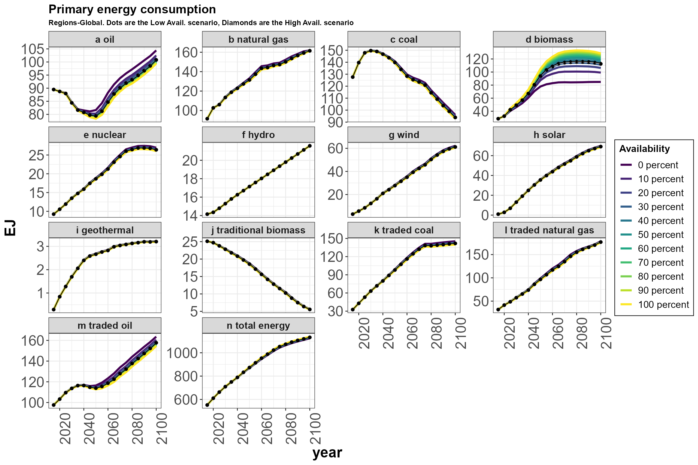
Primary energy consumption under different land availability constraints.
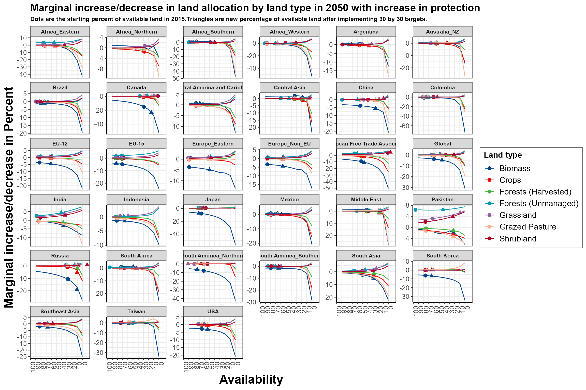
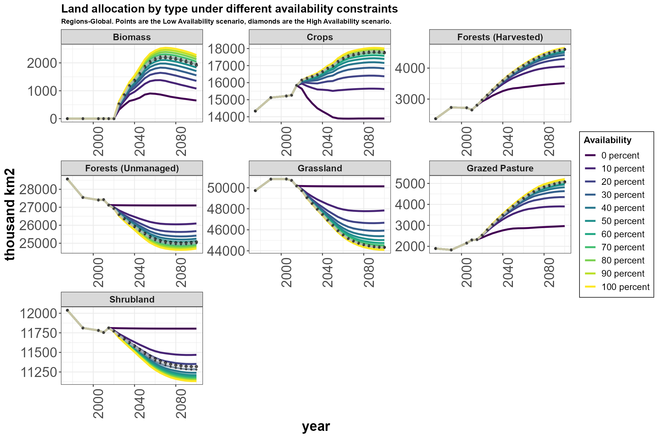
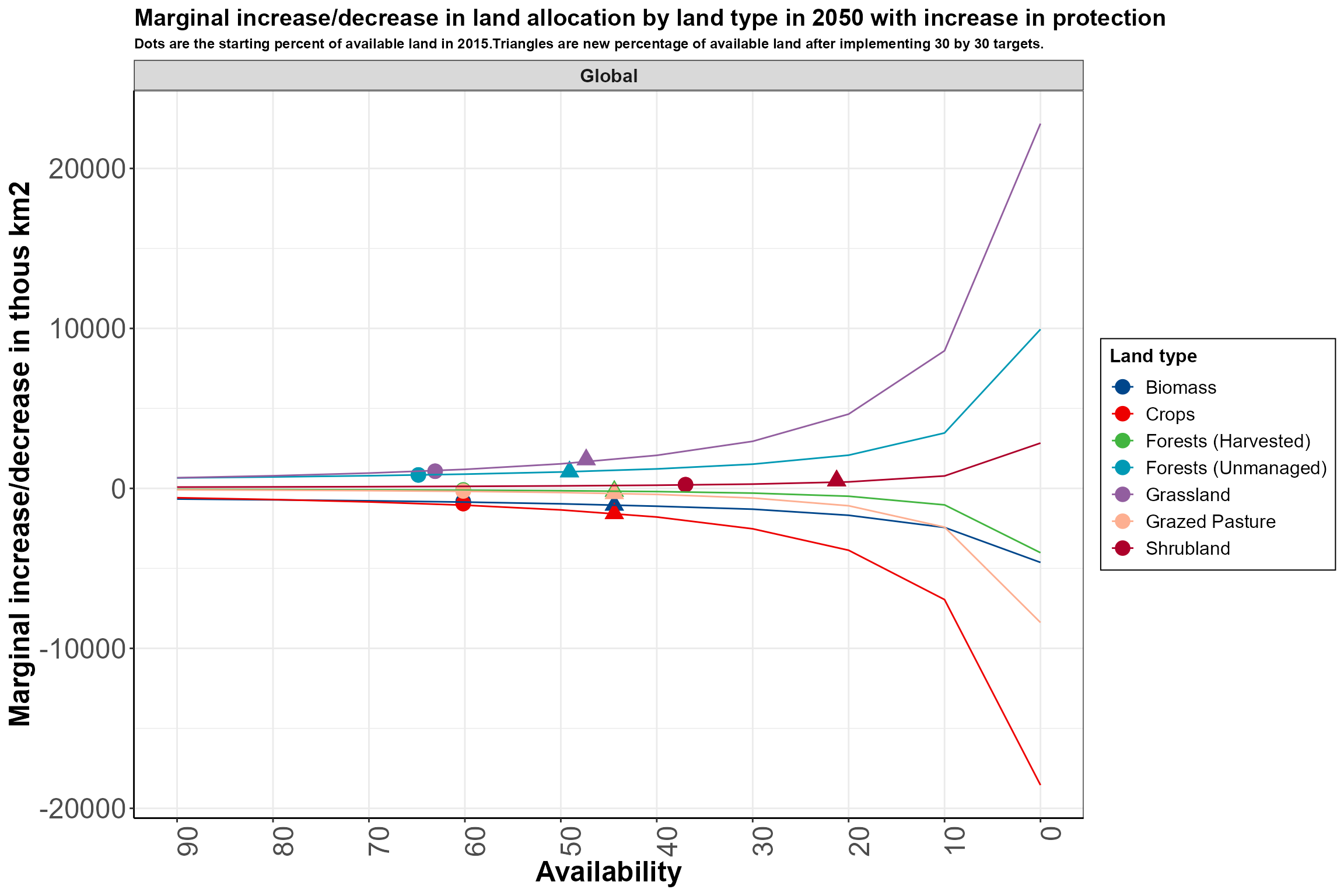
Protected_area_paper.RmdMarginal absolute changes in land allocation in 2050 due to incremental decreases in land availability, globally. The x-axis denotes a 10% decrease in land availability from the previous tic, starting at 100% availability. The y-axis values are absolute change in area relative to that at the previous availability level. Circles indicate the current availability and extent of unmanaged forest, grassland, shrubland, respectively, and of these three types combined (on the managed land type lines), based on the 2015 GCAM initial state. The triangles indicate land type availability and extent when protected area is approximately doubled. The absolute change in land allocation of a particular type due to meeting the new protection target is estimated by moving from the circle to the triangle along a given line.
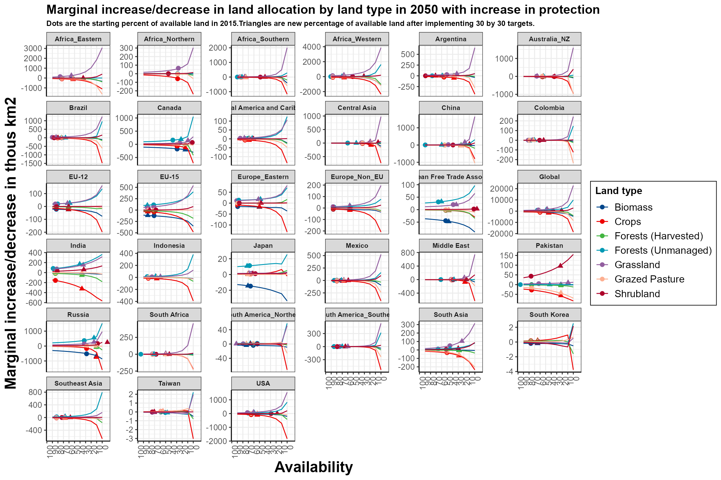
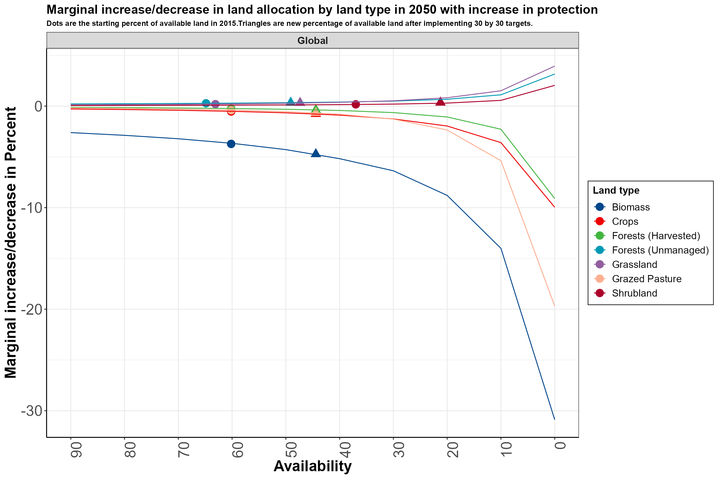
Marginal relative changes in land allocation in 2050 due to incremental decreases in land availability, globally. The x-axis denotes a 10% decrease in land availability from the previous tic, starting at 100% availability. The y-axis values are percent change in land type area relative to that at the previous availability level. Circles indicate the current availability and extent of unmanaged forest, grassland, shrubland, respectively, and of these three types combined (on the managed land type lines), based on the 2015 GCAM initial state. The triangles indicate land type availability and extent when protected area is approximately doubled. The relative change in land allocation of a particular type due to meeting the new protection target is estimated by moving from the circle to the triangle along a given line.